Tabs
It works like this:
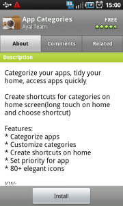
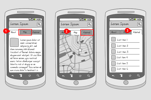
On a certain topic, the content is divided into 3 tabs. Each tab represents an aspect or section of the topic.
-
The first tab is here selected. It shows information about the topic. When the second tab is tapped…
-
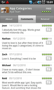
… that tab gets highlighted and the content corresponding to that aspect is shown. When the final tab is tapped…
-
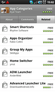
… it is selected and the corresponding content is displayed.
Use when
Tabs are used when you want an amount of information on a topic to be distributed over different sections. Those sections are displayed in a horizontal row of 2 to 5 tabs. The section labels are displayed in the tab.
Tabs are similar to segmented controls in wanting to help the user find particular data without changing the current view, but segmented controls work as filters, and tabs divide the data into different sections. When you want the user to switch between data that doesn't fit one set, you should use a tab bar.
The Good
- Straight forward way of distributing data over different sections
- Originally coming from web interfaces, so users are probably familiar with the principle
The Bad
- It can take up a lot of screen real estate, when the app also contains a title bar, or action bar, and a heading
- When more than 3 tabs are used, there's not a lot of space for a label
Examples
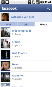
Android Market

9 Responses to Tabs
example scrip ?
newbie
Hi Djie-plong,
As interaction designers, we only make wireframes to show how something works. We cannot produce code. We are thinking about ways to let people add some code examples. If you have some ideas, please let us know.
Thanks! Caat
I don’t understand caat@unitid.nl. If they can upload pictures and add wireframes, why can’t they upload simple code? Android layouts are XML-based, so to upload an XML file and link to it wouldn’t be any harder than adding wireframes.
You’re right about uploading files to the site would be easy, Bobbie, but we want to focus this site on Android interaction patterns. That’s our expertise, and that’s what we can say things about. We don’t produce code, in what form so ever. More importantly in this regard, we also cannot judge if code is good or bad. As I said before, we are thinking about ways to add code, but it will probably be done by linking to sites like https://github.com/ or http://code.google.com/.
(dev note) If you are frustated with tabhosts and tabwidgets, you can use a skinned radio buttons instead. To skin them, change the “button” and “background” properties.
how can we design a custom tabs in tabwidget?specifically,how to just write text only and position it in the center of the tab?
It would be GREAT to see code example for each and every of those articles.
hi,
Do you have any sample applications showing each of these UI patterns?
Thanks
I think this is one of the best site for knowing all about android ui design. Really helpful. Thanks a lot! Great job!