Tab bar
It works like this:
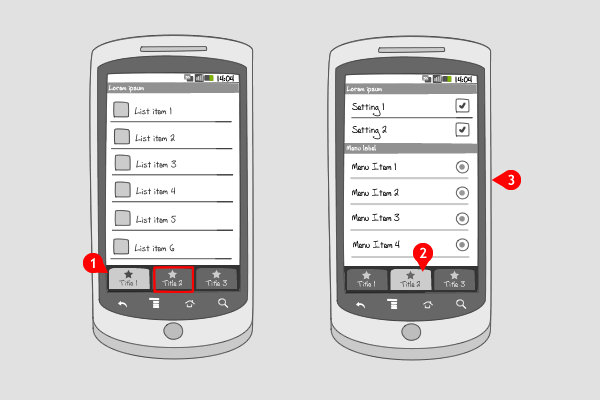
The tab bar can be positioned at the top or the bottom of the screen; the functionality is independent of its position. It can contain up to 5 tabs, that are equally spaced in the tab bar.
-
The first tab is highlighted, so the corresponding view is opened. When an other tab is tapped…
-
… the view belonging to that tab is displayed…
-
… and that tab is highlighted.
Use when
A tab bar can be used to switch between different modes or views in an application.The user should be able to access all the different modes from everywhere in the application.
This means the tab bar is always in the same location in the screen, highlighting which mode is active. Use the tab bar when your app has clearly defined modes, views or subtasks.
If you want to filter a particular set of data, e.g. display favorite items next to all items, use a segmented control. If you have more than 5 options to put in the tab bar, consider placing options in the options menu or in a carousel. You can also add a more-button at the right, which by pressing opens a dialog-menu. If you need all screen real estate for your content, a features dashboard can be used to provide similar navigation.
The tab bar should not contain buttons to perform actions on elements in the current mode. For that a toolbar is useful.
The Good
- Allows easy switching between modes, views or tasks
- Familiar navigation for users
- Main menu remains available for contextual options
- Tab bar allows users to focus on content
The Bad
- Takes up more screen estate than placing navigation items in the Options menu.
- Can only handle up to 5 navigation items effectively
- Any menu items near bottom may cause user to accidentally touch a hardware button (Jamie)
Examples
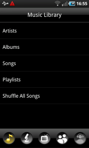
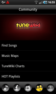
Tunewiki
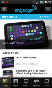
Engadget

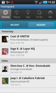
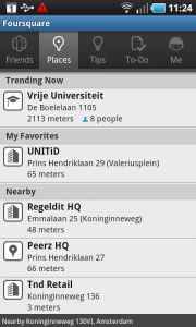
Foursquare
One Response to Tab bar
hi, how to set 3rd tab and its contents by default selected when an activity is start? please reply as early as possible.
Thanks in advance.