Mode selector
It works like this:
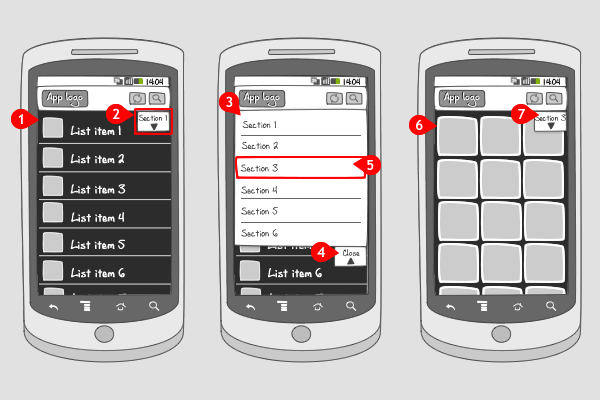
-
The user is viewing content, here displayed in a list.
-
Attached to the action bar or title bar is the mode selector. It contains an indicator, so the user knows that he can switch between modes or sections (the element by which the mode selector is defined), and a title of the section that is currently viewed. This title of section or mode can also be displayed in the action bar or title bar.
The mode selector can also be positioned on the left or right or inside the action bar or title bar.
Tapping on the mode selector… -
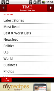
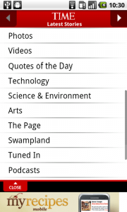
… and a pane with all other sections slides into the screen.
-
The pane can be closed by tapping on the indicator, or tapping outside the pane.
-
When the user taps on an other section in the pane…
-
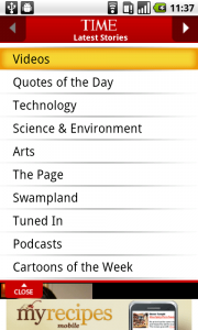
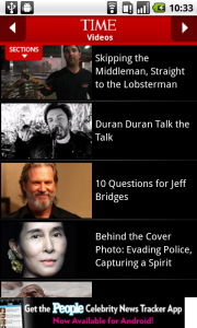
… that specific section, containing the corresponding content is displayed…
-
… and the mode selector indicates that this section is selected.
Use when
The Mode selector can be used when you have a lot of content to distribute, that can be divided into different modes or sections. The selector works as a filter on a vast amount of content.
Make sure that the sections you divide your content into are similar to each other. Don't add activities to the selector. When you want the user to toggle between different activities, use a tab bar instead.
When you don't want the content to be loaded by switching to an other section, you can use a segmented control.
The Good
- You can distribute a large amount of content
- The user gets a clear overview of the available content
- It's a appealing way to toggle between sections for the user
The Bad
- The indicator is often difficult to notice.
- List usually covers actual content (this can be avoided scrolling content down) (dario)
Examples
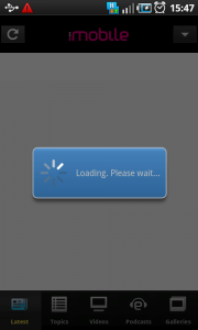
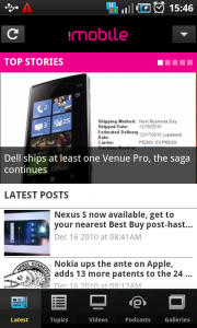
Time Mobile

Engadget
