Slideable top navigation
It works like this:
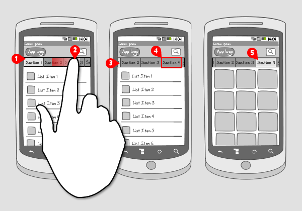
-
On top of the screen a horizontal set of buttons, tabs or labels is located, each representing a section in the app. By default, the at most left button is selected. Only a small number fits the screen…
-
… so the user can slide or fling it to the left to unveil the rest of the sections.
-
The section that was selected stays selected while moving and will even be invisible when moved far enough.
-
The user selects an other section…
-
… and the corresponding content is loaded and then displayed.
Use when
When your app distributes a lot of content that has to be divided into multiple sections, you can choose to take these sections up as items in a top navigation, that can be scrolled horizontically when it doesn't fit the screen width.
It is important that the items are similar to each other. The top navigation is not meant to contain any activities. For that you should use a tab bar.
The slideable top navigation can be used in the same situations as the mode selector. Also the window shade can be applied in similar situations, but in here functionalities can also be taken up, which is not the case in the top navigation.
The Good
- It is possible to take up multiple items in the top navigation.
- Easy switching to a different section. No extra tap necessary to show the sections (like in the mode selector), only a swiping gesture to unveil the items that lie outside the screen.
The Bad
- Scanning the sections horizontally is not easy (in contrary with the mode selector, which shows sections vertically).
- When a section is selected and moved, it can easily be invisible, while remaining selected.
Examples
Mashable





Pulse



2 Responses to Slideable top navigation
yes, this pattern is pretty useful for displaying dynamic pages.
We used Gallery control in our app to achieve similar kind of functionality. Checkout the link: http://www.youtube.com/watch?v=IP6SouK0x9M
Pingback: Quora