Scrollable rows
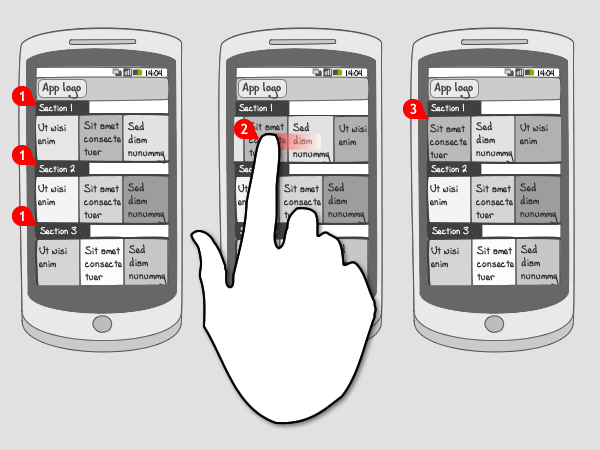
It works like this:

-
The user sees 2 or 3 rows of rectangles containing text and possibly images.
-
Each row is scrollable by itself independently of the others.
-
When the user stops scrolling the row items automatically align to the left of the screen.
Use when
This pattern is often used in home screens of news applications, where each row represents a category. Each item in the row is then an article. A row can contain up to 20 articles or even more. Because the screen can be scrolled up, more rows can be applied on the homescreen.
In some cases it is also used as main navigation in an application. The main idea behind the pattern is that you want to show items from multiple categories. At the same time the row items are large so you can easily select them.
You can combine the use of horizontal rows with a contextual navigation on the article page. If your app only contains a single category, you can use a carousel instead. An other way of letting the user switch between categories of sections the mode selector.
The Good
- Gives an overview of multiple items across at least 2 categories.
- Leads to a grid layout which maximizes the number of items you can fit on one screen
The Bad
- Because of the grid-like layout any text will easily wrap over multiple lines, making it harder to scan/read.
- Can be visually unattractive when many items are packed on one screen.
Examples
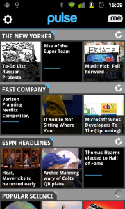
Pulse


BBC News


2 Responses to Scrollable rows
Really helpful.
Very nice article… Thanks