A few weeks ago, Elon Musk sent out a Tweet asking what UI changes we’d love to see in a future update, quickly gathering a lot of replies.
What esthetic and functionality improvements would you like to see in the 7.1 UI overhaul? Or new features entirely?
— Elon Musk (@elonmusk) October 21, 2015
It also resonated within our design studio: In 2014 we created the website carui.info where we reviewed several car interfaces and tried to identify the good and bad practices. In general we can say: Designing a (touch) interface for in the car is pretty tough. So we decided to put our digital design expertise to the test and gave it a shot. We sat together for an afternoon to come up with ideas and two guys worked out the results in this post.
Let’s start off by taking a look at the current interface. We think the Tesla user interface team did a great job in integrating the interface with the car and exploring new grounds. Having so little physical buttons is definitely a challenge. For years car manufactures solved everything with physical buttons. For a reason: with physical buttons you can literally feel where they are and their current state, removing the need to actually look at the interface. Eyes on the road is always safer. By introducing a 17″ touchscreen they ditched the interface we grew familiar with and introduced something completely new.
Read more on the history of the car interface on our CarUI website ›
We drove a Tesla for a few weeks to thoroughly review the Tesla interface. While we found that Tesla did a great job on the interface we did find some room for improvement: so our designers teamed up and designed 8 improvements.
1. Preconditioning for all
Smart preconditioning (beta) does not really work yet. People leave their house at different times and often have a very erratic schedule. We can make preconditioning a bit more usable:
- Ask the user about their schedule on weekdays on a certain time in the morning (using notifications or a widget on their phone)
- Pre-fill the driver profile, start the preheating based on your Estimated Time of Departure (ETD) (which is extracted from your calendar) and propose destination for navigation, all via the app.
- Make it very easy to change preconditioning preferences, again, via the app.
- Provide relevant options such as opening the trunk or charge port close to departure.

2. Passenger profiles
There is a profile for the driver but none for (recurring) passengers. There is no memory for seating preferences and no options for connecting a second smartphone.
- Add profile(s) for passengers
- Add connectivity for multiple phones

3. Redesigned dashboard
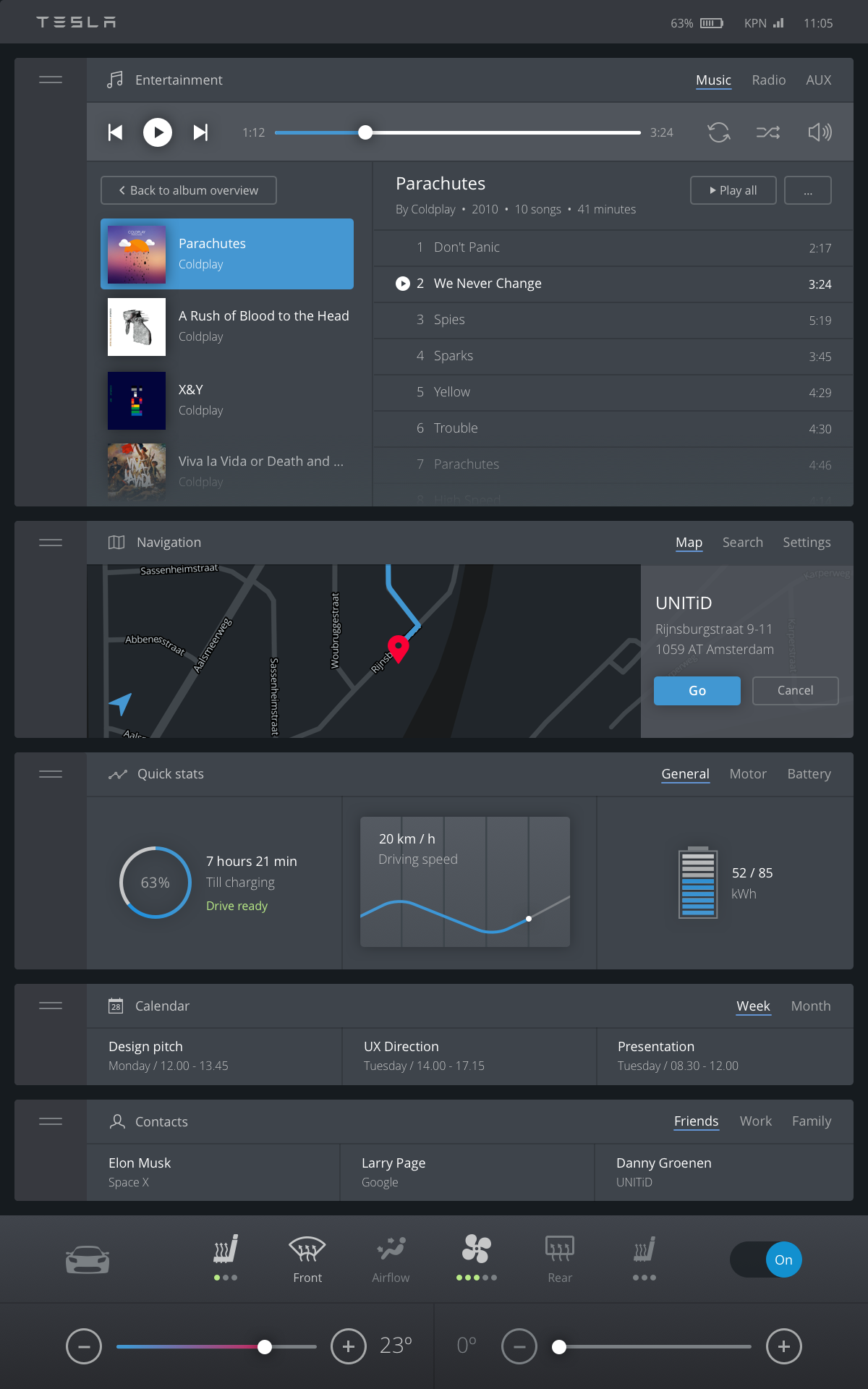
The current hub and spoke interface isn’t optimal when driving. It requires quite some cognitive power to control the UI. That’s why we want to redesign the interaction paradigm and use progressive disclosure to reveal content gradually.
- Create a dashboard with all sections visible at once
- Use progressive disclosure to reveal more when needed but provide the top tasks at the highest level
- Make them also accessible via the input menu on steering wheel so you can keep your hands on the wheel

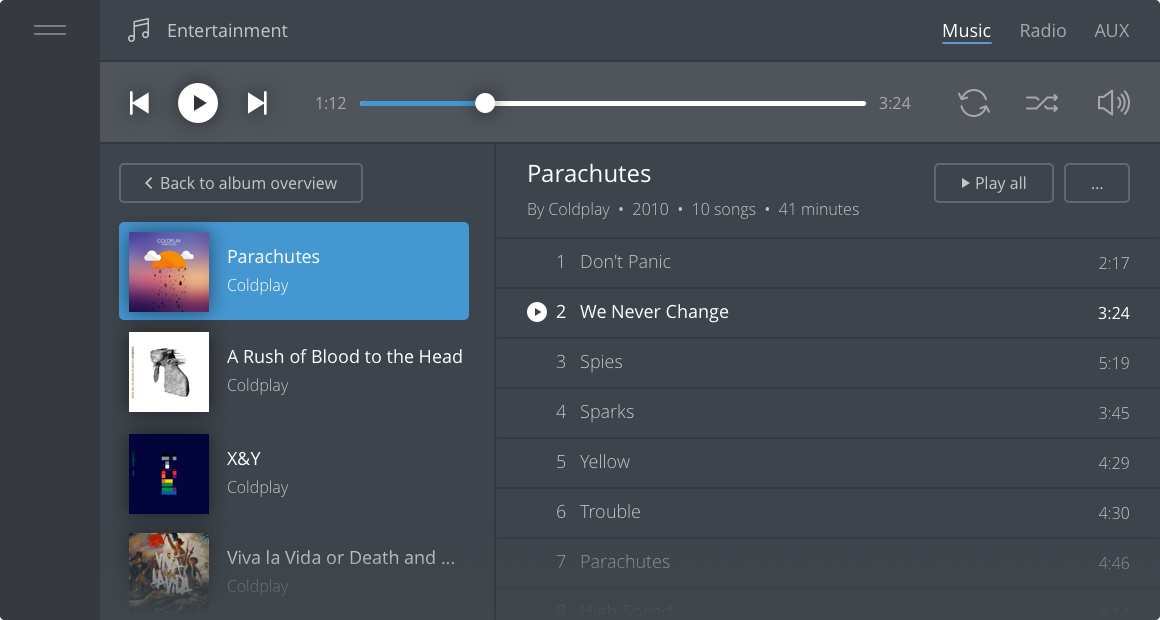
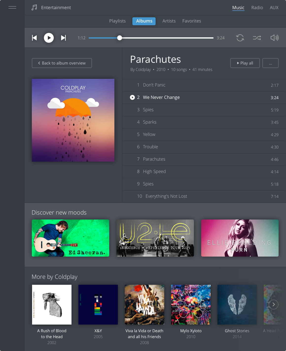
Each section on the dashboard has a small, medium, large and extra largestate. You can independently open or close the sections on the dashboard. You don’t have to go into a new screen. Each time you increase the state of the section you get access to more functionality. We love to call this progressive disclosure.
Because we arranged the app icons vertically instead of horizontally they are much easier to reach during driving. You can tap the whole left section to interact with it, no need to aim for a small button.


4. Better cockpit information
You can customize the widgets you want to display in your cockpit which is very convenient. We believe that you can show more relevant information in the cockpit, for example the Estimated Time of Arrival (ETA) for your destination.
- Show the ETA
- Show Point of Interest (POI)
- Display road obstacles

5. Smarter calendar integration
Drivers can be delayed due to various factors. Your car could actively help you by sending out messages to the people waiting for you.
- Tesla knows your ETA and could match it with your calendar or extract your destination from your text messages.
- It could send out messages or call people to update them on your ETA.

6. Simplified audio
The current audio section offers a lot of functionality. It also looks a bit complicated. You can easily get lost in the interface browsing for something to listen to. It currently takes a lot of steps to find your favourite radio station. And switching audio source to your phone for example, can be improved.
- Move favourite radio stations to a more prominent place.
- Actively present source selection options when a new input is detected on one of the audio sources.

7. Split the controls and settings
From a user perspective it’s not always clear where to look when you want to change a setting. Is it part of the general controls? Or is it a setting in a specific section? It requires a good understanding of the user’s mental model to structure the content in a straightforward way.
- Cluster all the settings into one single area so you know where to find it
- Simplify the UI of the control screen and introduce a better hierarchy
8. One visual language
We believe that the interface should be an extension of the car’s interior. The cockpit and the touchscreen display have a completely different appearance, suggesting that different designers worked on the individual sections of the interface. Within the UI the usage of colours and buttons isn’t consistent. Also in many cases a white UI spreads a lot of light in the car.Creating a darker UI would be easier on the eyes.
- Design a universal visual language for the interface which fits the interior design of the car
- Use color sparsely and consistently
Feel free to comment and share your feedback on this post. We are open to elaborate on the concept.
This post is originally published on Medium


