List navigation
It works like this:

-
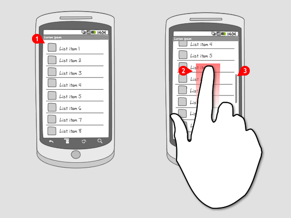
Content is displayed in a list. Items contain a title and are usually accompanied by an icon or image. Additional information is possible, as long as it’s still noticeable that it’s a list.
-
When the user moves with the finger in the direction he wants to scroll (in this case up), the list moves up through the screen, and new items are visible.
-
When the screen is still moving, an indicator shows the position of the viewed items in the complete list. When the user stops scrolling and the list stops moving, the indicator slowly fades out.
Use when
A list can be useful lots of times and is therefore applied very often. A list view is a simple and straightforward way to display navigation items, especially when the number of items is not too extensive. They are put in a single level, vertically scrollable list. Sub-headers that divide the items into groups can be used to make navigation easier.
When you have a considerable amount of navigation items, consider using an expandable list, or a drill down.
The Good
- It is a straightforward way to provide navigation.
The Bad
- User can loose his sense of overview when the list is too extensive.
- *User can lose his sense of overview when the list is too extensive ()
Examples
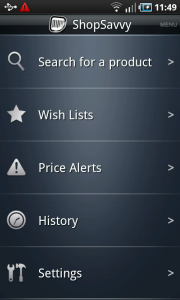
Shop Savvy

