Drill down navigation
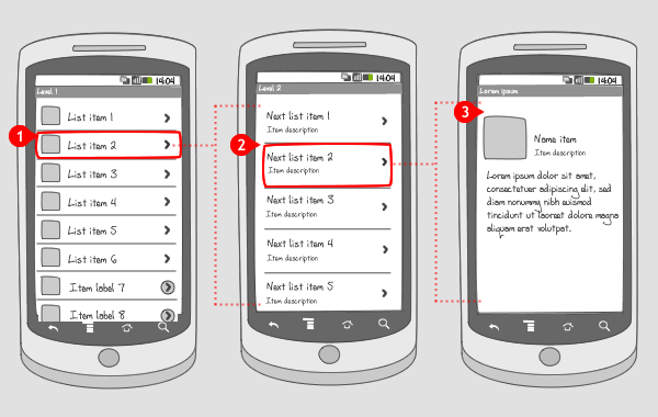
It works like this:
-
Information is organized in lists over multiple levels. Tapping on an item in the list…
-
…opens the next level. Tapping again on an item in the list…
-
… opens, in this case, the final level.
Use when
Often information has to be broken up into lists over multiple levels. Clicking on an item makes the user move into a level of greater detail, so the deeper into the hierarchy, the more detailed the information. The user can also drill down through a series of folders to find a specific file. Items can be edited in the last level.
When information needs to be displayed on the same screen, consider using an expandable list.
Do not use the drill down list when information needs to be compared or viewed simultaneously.
Also do not put too many levels in the drill down hierarchy.
The Good
- You can provide very detailed information on certain content
- Entire screen is available for displaying detailed information
The Bad
- Information can not be compared easily
- User might get lost in multiple levels of information (provide breadcrumbs)
Examples
Treintijden light



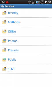
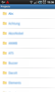
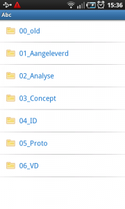
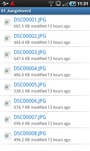
Dropbox
3 Responses to Drill down navigation
It is recommended to not use right-pointing carets!
The official Android design principles documentation advises against using right caret to depict drill down capability for a UI element as it’s inconsistent with the platform- http://developer.android.com/design/patterns/pure-android.html
This is EXACTLY what I’m trying to figure out HOW to do. The Dropbox example best fits what I want, only I need to be able to drill down like 4 or maybe even 5 levels before reaching the “fragment” or screen for that item. Is there a complete code example anywhere for this? I’ve looked everywhere and can’t find. Thank you in advance for any help you can offer!