If you design digital products, you will be confronted with slicing and exporting your visual assets so a developer can implement your design. If you are still in the prototype phase, please check out our popular prototype-tool: TAP for Fireworks.
For the web this is pretty much a straight-forward task. You can export the assets in just one size or use stylesheets to adapt to different resolutions. If you are designing an app that should run on Android and iOS devices, things get complex. You don’t want your button to look great on the iPhone 4s and blurry on the iPhone 3, right? Here are 10 tips we gathered along the way to help you slice and export assets for mobile apps. We use our favorite program Adobe Fireworks CS6 for designing, slicing and exporting.
(note: This is not a hands-on tutorial about how to create and export slices with Fireworks. If you are not familiar with the basics of Fireworks and slicing, check one of these videos.)
1. Talk to the developer
Talk with the developer of the app before you start. Developers have different ways of implementing the design. This is especially important with scalable assets like backgrounds and interactive elements like buttons.
Because you have to deliver (at least) four different assets for just one image, it will be a waste of time if the developer is expecting a different set.
2. Collect them all!
Assets should not be scattered around in folders, emails, libraries or different source files. The chance you have to change an asset is 99%. If it is not this release, it will be next year when your client decides to redesign their corporate identity.
So, get all your assets in a single document like this: Create a new file for your assets with the same name as the source file, add “_assets” to the filename. This way you always know where to find the assets of a specific file. Copy the assets from the original file and paste them in the new one. This will also help if more than one person works on the project. Place similar assets (like icons, backgrounds etc) close together on a page, so you have an clear overview of all assets. Always use a transparent background when exporting your slices with transparency (PNG 24 / 32).
3. Every pixel counts
Slicing assets needs to be done very accurately. Take different button states. Active, inactive and pressed states of an asset need to align perfectly and have exactly the same size, otherwise it will look like the button is moving when you touch it.
To avoid blurry images always use snap to pixel (Mac cmd-k – Windows ctrl-k).
If you have a set of assets, like an icon set, it is recommended to create slices with similar dimensions for the whole set. Make them all 30×30 or 40×40 for example. After you exported the images you can check if the states match, by going through the images in Preview go back and forth between the states to spot minor differences in alignment or image size.

4. In iOS, size matters
If designing for a universal iOS app, you have to deliver assets at four different sizes. Retina and non-retina for iPhone as well as iPad.
Retina assets have to be exactly twice as big as non-retina images. You can scale the non-retina asset with 200%. Always double check if the slice is really twice the size.
If you design in retina resolution, keep in mind you have to downscale your images back 50%. So 1px lines or objects with uneven dimensions (like 31px or a 19px font) will give you trouble. What happens with the 1px line? How to handle a 15.5px images?

5. Android: Yes, more images
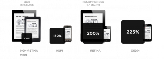
If you are (also) designing for Android, you’ll probably know that there are a lot of Android devices with different resolutions. Android thinks we have tons of time. You can see it coming, right? Yes, you have to export all the assets for (almost) all resolutions. Most common resolutions are:
Android Tablet
1280 x 800
1024 x 600
Android Phone
320 x 480
480 x 800
480 x 854
540 x 960
1280 x 720
For tablet you have to deliver the assets for two resolutions and for phone it is common to deliver assets for (at least!) three or four different resolutions. You can use the same asset size for 480×800 and 480×854 and sometimes also for 540×960, but this is something you have to discuss with your developer before you start slicing. Assets like headers, that are covering the whole screen width, must be delivered for all width sizes at all time (so four sizes for phone). Except for 9-patch assets of course.

Read more about Android screen sizes.
6. Getting the right asset sizes for Android
So how do you know what size your asset needs to be for all resolutions? Luckily somebody created a tool for this, so you don’t have to struggle. The Teehan+Lax Density Converter allows you to input the width and height for any density, and instantly see the dimensions you need to scale the graphic for each of the other densities. You can find more information on http://www.teehanlax.com/blog/density-converter/.

7. Use 9-patch scaling for Android
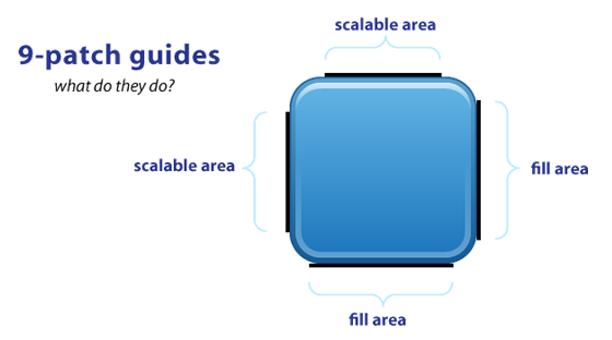
If you have assets that are used more than once in your application and are scalable, think about 9-patch scaling (don’t confuse it with the 9-slice scaling of Fireworks). You can use 9-patch scaling for scalable items like button-backgrounds. Things like icons will probably not scale properly, so unfortunately you have to resize them manually for all the resolutions. The 9-patch guide is always 1 px thick and must be black (#000000), otherwise it won’t work. Your slice will always be 2 px bigger than the asset (1px left and right and/or at the top and bottom). Thus if your asset is 48x48px your slice will be 50x50px. You can’t downscale 9-patch images, so you have to deliver them at the smallest size possible. This is also better for the overall performance of the application. You can use the Draw9Patch tool from Android to easily create or check your 9-patch images. For more specific information on 9-patch scaling and/or downloading the draw9patch tool check the Android Developers website.

Image source and more information: http://radleymarx.com/blog/simple-guide-to-9-patch/
8. iOS naming conventions
You probably aren’t the only one working with the (exported) assets. Everyone must be able to find the right assets easily. Also, you don’t want to overwrite existing images because you ran out of names. To keep your exported assets accessible, be consistent in naming your slices at all times (!) and agree on naming conventions with the developer. It is also useful to export your iPhone and iPad assets to separate folders named “iPhone” and “iPad”.
Most convenient slice-naming is: “screenname_type_thing / action_state” (state is optional) You are free to use whatever name you think is most suitable of course, consistency is the key. Also agree on language (do not use two languages at the same time, ie Dutch and English)
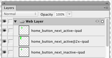
For iOS the following suffixes are documented and can be added for differentiating the various devices and resolutions:
@2x for retina indication
~ipad for device differentiation
@2x~ipad for using both
So your exported assets will have names something like this:
“home_button_share_down~iphone.png” and “home_button_share_down@2x~iphone.png”
“home_icon_logo~ipad” and “home_icon_logo@2x~ipad”
Bonus tip: You can edit your slice names in the Layer panel. Much more space than in the Property panel!

9. Android naming conventions
For Android it is also very important you are consistent with slice-names at all times(!). Again, make two folders for phone and tablet. Export specific assets to the correct folder and export 9-patch images to the root folder. They are used for both devices.
Agree on Android naming conventions for naming the slices. You can take a look at the Android Icon Design Guidelines for some useful tips.
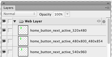
We agreed on the following convention: “screenname_type_thing / action_state_resolution” (state is optional) or “screenname_type_thing / action_state.9”. Depending on slice type: add resolution if the slice is only usable for that resolution, add .9 if it is a scalable item that can be used on all resolutions. Make sure that the outer border actually contains guides for the 9-patch!
Assets will be named something like this:
“home_button_share_down_1280x800” and “home_button_share_down_1024x600”
or “home_button_share_down.9”

10. The symbol library is your friend. Use it wisely.
Your initial design will probably be edited a few times along the way before you deliver the final visual designs and assets. Even after final delivery you sometimes need to update the design. That’s why you should use a library with symbols as much as you can. You don’t have to update every assets one by one. Just use the library in different documents (so in your source file and in your assets file). When symbols are edited in the source file, you can update the symbols in the assets file with a single click. Look at the Adobe Help Center how to do this.
That’s it! Please feel free to add tips to the comments


Posted: 20:36 on 28 July 2012:
28 July 2012 on 20:36:
Some comments on your article:
– PNG 24 is NOT transparent, PNG8 and PNG32 however are (or can be).
– You’re mixing up resolutions and densities
– It looks as if you’re implying that you need all different assets for tablets and phones
– Android can perfectly scale down resources, so if you only provide XHDPI resources, they get scaled down to HDPI, MDPI and LDPI.
– The part describing what assets to use for what resolution completely ignores the fact that you can use multiple layers of imagery, so you don’t need to think of screen sizes. And that the platform has support for gradients and rounded corners through (density-independant) xml files.
– Your Android naming conventions actually make things harder, by not using names like mdpi, hdpi and large/xlarge. Also there are naming conventions for drawable assets on http://developer.android.com/guide/practices/ui_guidelines/icon_design.html#design-tips.
– Don’t just ‘add .9’ to a filename, first make sure that the outer border actually contains guides for the 9-patch.
Posted: 07:23 on 21 May 2013:
21 May 2013 on 07:23:
One sec – PNG24 is not transparent?? What are you talking about?
Posted: 16:03 on 24 April 2015:
24 April 2015 on 16:03:
Yeah…. what are you talking about?!? Of course it is. PNG-24 provides support for background index transparency and matte.
Posted: 12:44 on 30 July 2012:
30 July 2012 on 12:44:
Thanks for your comments Marijn. I made a few quick corrections to our post based on your feedback.
For some of your points, different developers clearly have different opinions. It seems like you use a more efficient way to create the assets (only create the XHDPI versions). I think it is time for us designers to have a chat with our developer.
Posted: 22:24 on 31 July 2012:
31 July 2012 on 22:24:
Matthijs,
Also, while I’m a Fireworks user myself, I find it difficult to use for density-independent work like this, since Fireworks will only work with integer values. Therefore I’d recommend using Illustrator, and exporting your assets at different PPI’s. Of course you need still need to optimize for some densities, but as long as you’re using MDPI as your baseline, you can be assured that at least two densities look sharp during development (MDPI itself, and XHDPI since it’s just pixel-doubled).
I just found this calculator in the comments on the linked Teehan+Lax post: http://coh.io/adpi/ this one uses the official scale, and also warns you if you’re working with a dimension that doesn’t scale well.
Posted: 10:26 on 8 August 2012:
8 August 2012 on 10:26:
We should do some tests for our next Android project with Illustrator. The disadvantage I think is that our complete workflow, from wireframes to prototype to visual design is in Fireworks, making it easy to copy paste the assets to the assets PNG.
Thanks for the link to coh.io, nice tool.
Posted: 07:27 on 17 October 2012:
17 October 2012 on 07:27:
I was wondering why no one have ever tried to convert the icon into font ( similar to using font icon for web development ). The font icon can be scale to any size and it would be much easier than create different icon size sets for different screen size
Posted: 19:19 on 23 October 2012:
23 October 2012 on 19:19:
Really pro tips. Thanks guys. Especially love the one canvas idea. I’ve got assets everywhere in multiple psd’s. It’s insane!!!!
Posted: 23:00 on 29 August 2013:
29 August 2013 on 23:00:
Is Adobe going to support Fireworks going forward?
I’ve always liked it better than Photoshop for UI design. Its just plain better. But it felt funny that everyone wasn’t using it. Illustrator is my second choice since the vector art just makes sense. I never saw why Photoshop gets all the use. Is it because it has a few filters or is it just that people don’t know any better? At this point, I’ve just decided to join the bandwagon and use Photoshop. I create most art in Illustrator and paste into PS as a shape or symbol and just deal with it.
Exporting out of PS is easy by using a script that exports at every Android resolution.
Posted: 20:37 on 16 September 2013:
16 September 2013 on 20:37:
Thanks for this article, In the past I use adobe illustrator to slice up the graphics, i keep my artboard at the @2x screen size then copy and paste in place to spread out my page design for slicing. Problem with this is your files get spread everywhere as you say. I have not tried using fireworks but i should. This may not work for all the devices i will need. Great article thanks.\
this link helps me with exporting
http://www.ericson.net/content/2010/09/export-named-artboards/
Posted: 02:55 on 16 January 2014:
16 January 2014 on 02:55:
Thanks for the ideas you have contributed here. One more thing I would like to state is that laptop memory specifications generally go up along with other advances in the technological innovation. For instance, as soon as new generations of cpus are made in the market, there is certainly usually a related increase in the shape demands of all laptop or computer memory and also hard drive space. This is because the program operated by these cpus will inevitably rise in power to benefit from the new know-how.
Posted: 17:16 on 25 August 2014:
25 August 2014 on 17:16:
Thanks very much .. it’s very nice
Posted: 11:36 on 21 April 2015:
21 April 2015 on 11:36:
I am very fedup with one thing : could you clear my doubt i give 16th sizes slicing to my android developers since 2 year.
they say, they are right but when I read google article and android design ways then i find we only need 4-6 size slicices which
1. ldpi
2. mdpi
3. hdpi
4. xhdpi
5. xxdpi
Posted: 10:38 on 28 May 2015:
28 May 2015 on 10:38:
@Vishal,
I am an Android Developer and researching on building Universal UI (which run on all devices pixel perfect). Found that
1. ldpi
2. mdpi
3. hdpi
4. xhdpi
5. xxdpi
are for mobile devices not for the Tablets because table use like SW600DP, SW720DP.. so that your developer require more than 5 size..
Thanks if helps..
Posted: 08:17 on 20 August 2015:
20 August 2015 on 08:17:
Thanks for the article mate, very informative, However on few points my opinion entirely different but anyways thanks.. 🙂
Posted: 21:33 on 9 May 2016:
9 May 2016 on 21:33:
Thank’s for the article , one question, I heard once that the main principal img (xxhdpi) need to be dividable by 3 (/3), same for IOS (@3X), it’s that true ?
Posted: 06:20 on 11 November 2018:
11 November 2018 on 06:20:
For point number 5, we can use service like Image Baker https://www.img-bak.in/ for generating different sized assets for android.