Toast message
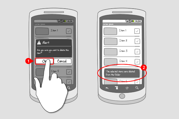
It works like this:
-
A toast message can be triggered by an action the user takes, or be fired by an app itself.
-
The toast message automatically fades in and out on the surface of the current screen and only fills the amount of space required for the message. A toast message does not accept user input. The user’s current activity remains visible and interactive when a toast message pops up. The toast message can appear even if the application isn’t visible.
Use when
The toast message is best used for short text messages, such as 'File saved,'when you're fairly certain the user is paying attention to the screen. Toast messages can be used when your app is not active, but might be missed due to their brief nature. A toast can not accept user input; if you'd like the user to respond and take action, consider using a status bar notification or a dialog instead.
The Good
- Efficient message when user is already paying attention to screen
- Minimally disruptive to screen content
- It was a very interesting post thanks for writing it! (googlepo)
The Bad
- User can miss notification when not paying attention to the screen
- Toast can not accept user interaction events
- Toasts always comes at the same place. (SAHIL RALLY)
Examples
Wordpress


HTC Sense - Alarm
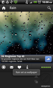
Zedge
4 Responses to Toast message
Toasts and Alert Messages are not the same, they have different usages and different advantages and disadvantages.
Alert Message force the user to acknowledge while toasts may pass unnoticed
It’s my opinion that the toast message notifications in Android should not be abused (used to frequently by apps). The information that they display should give the user extra information that previously wasn’t present in the UI or delivered by some kind of affordance.
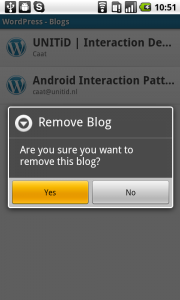
This is why the WordPress example is an example when it is unnecessary to display a toast message.
In the first screen the user makes an active choice to remove a blog post hence they are aware of what consequence their action will have. Screen two gives them further indication too what they are about to do as they are asked to confirm the deletion. In the last screen the user is returned to the list where they started and the item they deleted is no longer pressent. This will indicate to the user that the item was actually deleted. At this point I would argue that showing a toast message that say “Blog removed successfully” is unnecessary.
No don’t get me wrong, toast messages aren’t evil, aslong as they are used in such a manner that they add something useful to the user experience.
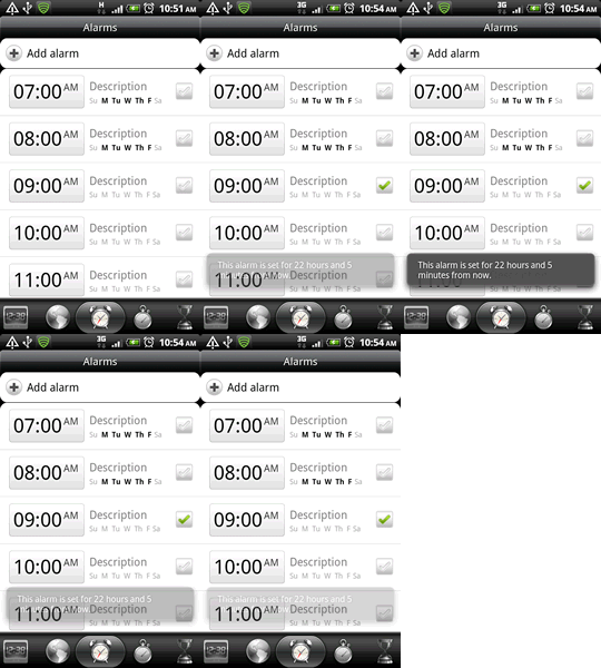
A god example of that is the the HTC Sense alarm. In this example the toast message gives the user a piece of information that isn’t statically present in the GUI. Of course the user could calculate the time until the alarm goes of by her self but by displaying it in a toast message you lighten the cognitive load for the user and that makes the app easier to use.
What am I trying to say with my rant. That the section “User When” should be rewritten to more clearly state in which scenarios a toast message is preferable. When it is not. And what kind of information it could provide.
You can position toasts. I think the “bad” listed by SAHIL RALLY is incorrect.
Quote: “You can change this position with the setGravity(int, int, int) method.”
Their example code for top left: toast.setGravity(Gravity.TOP|Gravity.LEFT, 0, 0);
See: http://developer.android.com/guide/topics/ui/notifiers/toasts.html
your articles is awesome
tanx for that