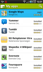
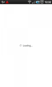
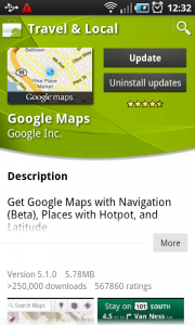
Progress wheel
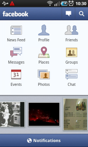
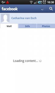
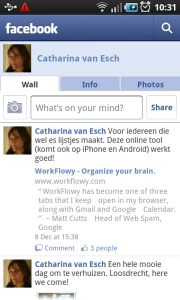
It works like this:
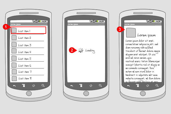
-
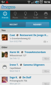
The user taps on an item to open it.
-
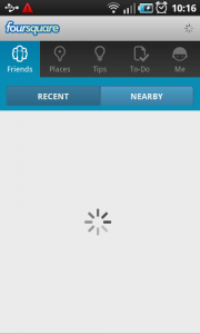
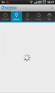
A blank page with a progress wheel is displayed, showing the user that the content is loading.
-
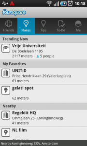
When loaded, the content is displayed.
Use when
A progress wheel is used to indicate an app is busy loading content to display. It can be applied to a complete screen, when the whole page has to be loaded, or only to a part of the page, e.g. in a module tab in which content has to be loaded. In addition, a small progress wheel in the title bar or action bar can be added.
The progress wheel is displayed within the current screen. So not on top of it in a dialog, nor is it triggered by a specific action from the user, like the progress wheel dialog in both cases would be. It is shown e.g. when the user moves from one app, screen, or tab to the other and the page needs some time to load the content. The progress wheel doesn't quantify the progress that's being made. For that you should use a progress bar.
If you want to show quantified progress for a certain action that the user triggered, you should apply a progress bar dialog. When you want to show the progress of an event that's running in the background, you should use ongoing status bar notifications.
The Good
- The user knows that content is loading
- Because loading the content is done inside the screen, instead of on top of it (as a progress wheel dialog would), the user can easily move away to an other part of the app
The Bad
- The user doesn't have an idea how long it will take the content to be loaded
Examples
Foursquare
Android Market
