Progress wheel dialog
It works like this:
-
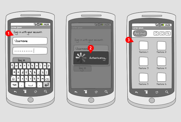
Progress wheel dialogs can be applied in lots of tasks and contexts. In this wireframe the user is logging in to an application. He first fills in his username and password and hits the log in button.
-
The log in details need to be authenticated. During this process a progress wheel dialog is shown, meaning the user doesn’t know how much time it will take for the task will be finished.
-
When the log in process is done, the user enters the app on its opening page, here a dashboard.
Use when
A dialog is usually a small window that appears in front of the current activity, making the underlying activity loose its focus. Progress dialogs are mainly used to indicate an app is (down)loading items. If you want to show your users that your app is busy with the activity and making progress, however you cannot define how much progress is being made, a progress wheel dialog can be used.
If you want to show quantified progress, you should apply a progress bar dialog. When you want to show the progress of an event that's running in the background, you should use ongoing status bar notifications.
The Good
- The message that an activity is taking place is clear
- \"While processing the user cannot perform any actions in the app.\" This could be good, i.e. authentication required before application use (aw4y)
- User can cancel its whenever want(if implemented that way) (Burak Dede)
The Bad
- User doesn't have a clue how much time the process will take
- While processing the user cannot perform any actions in the app. He is forced to wait, or jump to an other app
- There is no button to cancel the process that is shown by a progress wheel dialog
- Its not always obvious to user how to cancel dialog (Burak Dede)
Examples



Foursquare



4 Responses to Progress wheel dialog
Nice little series, what are you using to create your wireframes?
Been looking for something that has phone widegets
We use fireworks and a template for making the wireframes. You can find the template in the toolkit and help us make patterns.
nice share..and where i can get the tutorial step by step to build this source code.
thx
I see both the pros and cons of the progress wheel dialog, however when authenticating a user I don’t see why it would be applicable for the user to do other things within the app.
With that being said mobile allows those in UX to think outside of the box such as facial recognition etc., however that still takes processing time and the user’s signal strength or wifi connectivity affects this process.
I’d like to see if anyone can share suggestions on how to create a better process.