Search – Dedicated item
It works like this:
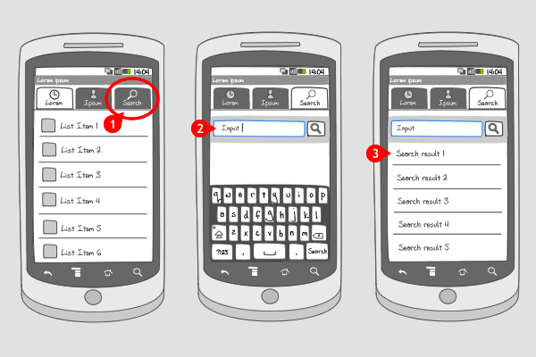
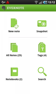
A dedicated search item is a button that can trigger a search in your app. The button can be placed in a tab bar on top (as shown above) or at the bottom of the page, on a dashboard, as a list item in a list, or in an action bar.
-
When the item is tapped…
-
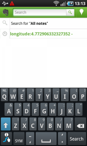
…a search-bar or search-window appears, where users can enter search-term.
-
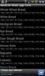
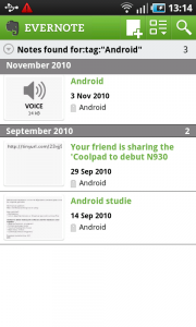
After tapping enter on the soft keyboard or tapping the search icon, a list of search-results appears.
Use when
The ability to search can be vital in your app, e.g. when you supply a lot of of content and the user needs to be able to find it quickly. When your screen lay out isn't suited for an action bar, and the search option is too important to put away in the options menu, you should consider a dedicated button in a tab bar, dashboard or in a list navigation.
The Good
- It's easily accessible for users
The Bad
- Takes up valuable screen real estate
Examples
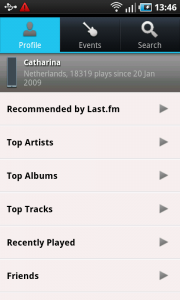
Last.fm


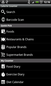
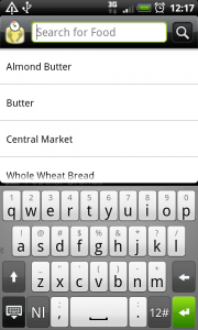
Calorie Counter
Evernote
4 Responses to Search – Dedicated item
Isn’t a search button in the top kind of redundant, since there always is a search button in the bottom right on all Android phones?
Not every Android device has a search hard key. For example the Samsung Galaxy S doesn’t have one. On a lot of devices (or maybe on every device, but we do not have them all to test it out), you can longpress on the menu hard key to launch a search bar.
Also, it is not necessarily redundant to have multiple (two or 3 ways) to perform a search. In a lot of apps search is an important functionality, that users want to get to in many different ways.
Typo on “Take sup valuable screen real estate” under The Bad.
Interesting and useful set of design guidelines, kind of similar to a “Best Practices” list. It would be nice to have code snippets or examples to follow along with, perhaps, if you are open to contributors, I could work on creating some?
Thanks for showing the typo, it’s corrected!
We’re certainly open to contributors. Exploring github right now for letting people create code examples. We could link to there. I will contact you, if allright.