Search – Search bar
It works like this:
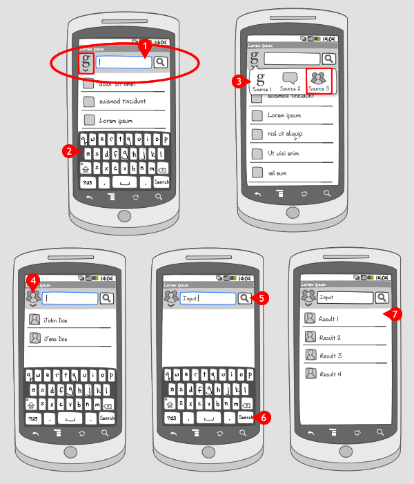
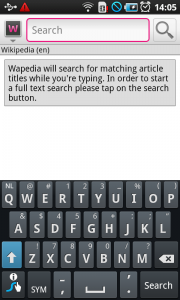
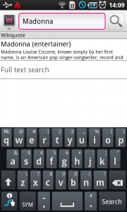
The search bar is anchored at the top of the screen and replaces the action or title bar. It contains 3 elements: a text field for letting users type in search terms, a search button on the right to start the search, and an optional pop-up selector on the left, for selecting a search mode. Presence of the pop-up selector is shown by an indicator pointing down.
-
When the search bar is launched or activated, the text field is selected, and a cursor is displayed, indicating the user can start typing.
-
Also the keyboard slides in from the bottom. Together with launching the search bar and keyboard, a list of previous search terms related to the selected icon in the pop-up selector is displayed. Note that the terms have secondary information, next to the label. To switch search mode the icon for the pop-up selector is tapped.
-
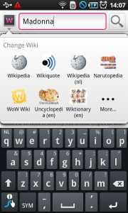
The pop-up selector opens, in which the user can choose the desired search mode. The text field is not selected when the pop-up selector is opened. Tapping on a different icon…
-
… opens the corresponding search mode. The text field is selected again.
-
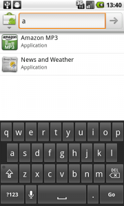
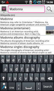
When the user starts typing, suggestions are presented. The user can start the query by tapping the search-button…
-
… or by tapping the enter-button, which usually displays the text ‘Search’, or ‘Done’.
-
When the query has been made, the results are displayed in a list.
Use when
The search bar has to be applied consistently for all searches, i.e. search bars at a fixed location on top of the screen, but also searches coming from a dedicated button in the action bar, a hard key, or an option in the option icon menu. They should all work alike.
Use a dedicated search bar at the top of the screen if searching for relevant items from a lot of content within the app will be used often by the user.
The Good
- Easily recognizable, because it works the same for every app
- Multiple search modes available, which makes filtering possible
The Bad
- It is not so obvious that multiple search modes are offered. The user has to notice the indicator.
- There are devices without a dedicated search button (the international Galaxy S, for example). (Greg K.)
Examples
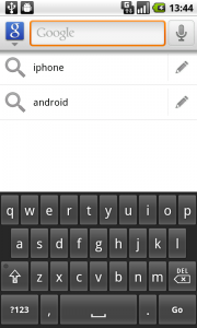
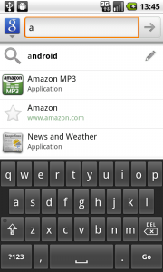
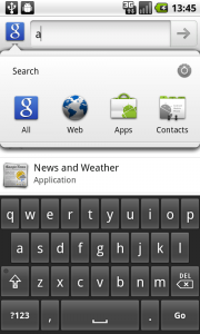
Google Search
Wapedia

One Response to Search – Search bar
please send the search home screen design