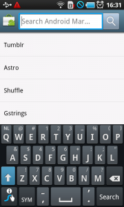
Search – Main menu
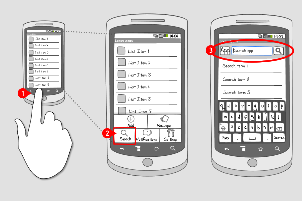
It works like this:
-
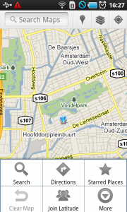
The user presses the hardware menu button, and the options menu slides into the screen.
-
The user taps on the option ‘search’ …
-
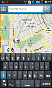
… and the search bar appears at the top of the screen. On the left the app-logo is displayed. (When multiple search modes are supported, the app logo is replaced by an icon for the corresponding and selected search mode, together with an indicator) The text field is selected, on the right the search button is displayed, and the keypad slides in from the bottom.
Use when
Search for content is often an important feature within an app, but when screen real estate is limited and applying a search bar or an action bar with a dedicated button in it is not possible, you should put the option in the options menu. Search in the options menu can very well be used together with a dedicated search bar (at a fixed place at the top of the screen). This usually happens when the search option is important.
The Good
- Saves screen real estate in comparison with dedicated search bar
The Bad
- Takes multiple taps to get to the search option
- The search location is often not clear (whole app or just this screen?)
Examples
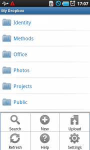
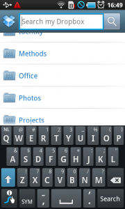
Dropbox
Google Maps
Android Market

