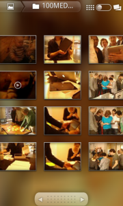
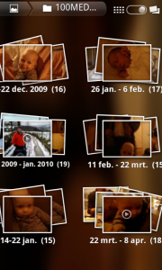
Change view – Dedicated button
It works like this:
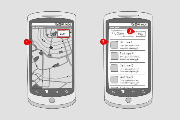
-
A certain set of data, in this case a set of search results, is shown on a map. The button in the top right corner indicates that the user can view the results on a list as well. Tapping on the button…
-
… changes the map view into a list view.
-
By tapping the button in the upper right corner again, the user can return to the map view.
Use when
A set of data can be viewed in all kinds of ways, e.g. in a list, on a grid, or on a map. The user might want to toggle between views to see the data in an other layout. Most commonly from list view to map view, and from list view to icon view. The button can contain text, an icon, both icon and text, or it can look like a switch between two icons. The button doesn't have to be placed in the same spot on each view, but this might confuse the user. It is recommended to always provide the user with the option to switch back and forth.
When you always want to have the option to change the view available for the user, you should apply a dedicated button. When your screen space doesn't allow a dedicated button, you could consider a change view option in a tab bar or the options menu.
The Good
- User can see directly what different views are available
- User has to click only once before changing the view
- If the result is a lot (>10), then the list view will help user to search. (Borrys Hasian)
The Bad
- The button is always visible, even when it is not needed.
- The \'Map\' button looks like a button to search, because it\'s placed next to the Query Text Field. (Borrys Hasian)
Examples
Layar
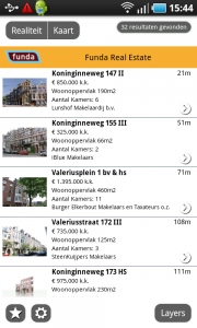
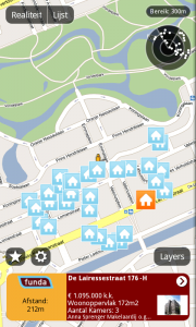
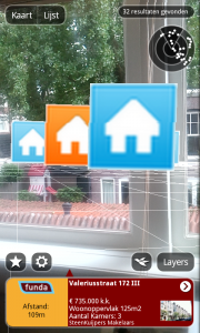
Google places
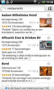
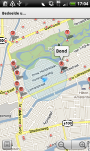
Gallery
