Alert dialog
It works like this:
-
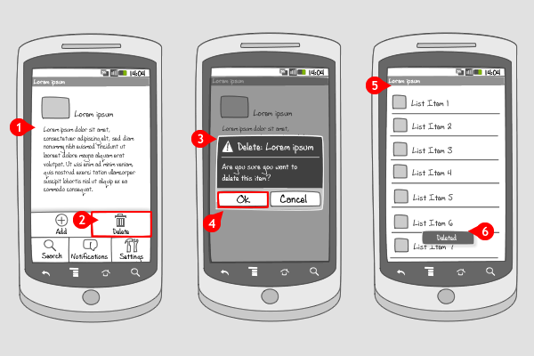
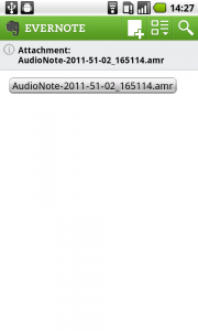
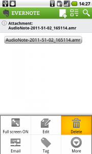
The user is viewing a detail page with certain content. He presses the menu hard key.
-
The options menu slides into the screen, after which the user chooses the ‘Delete’ option.
-
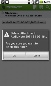
An alert dialog appears over the darkened screen, asking the user if he is sure he wants to delete the item.
-
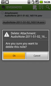
The user can choose to cancel or to go ahead deleting the item by tapping the OK-button.
-
The user returns to the list where the item came from (or to the previous item in the set).
-
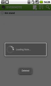
A toast message confirms that the item is deleted. This toast is optional, but recommended when the nature of the action that has taken place asks for a confirmation.
Use when
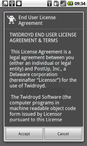
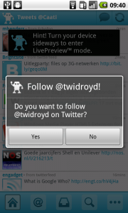
A dialog is usually a small window that appears in front of the current activity, making the underlying activity loose its focus. An alert dialog is a dialog that requires the user to take note of a message that relates to the current activity, by responding to it. This can be all kinds of activities, irreversible like deleting, or trivial, like 'Do you want to follow us on Twitter?' The activity needs input from the user, otherwise the action cannot take place. To get this response, the alert dialog can hold zero, one, two or three buttons, and/or a list of selectable items that can include checkboxes or radio buttons.
An alert dialog is often combined with a toast message, confirming the user that the action has been taken. When the chosen action doesn't require a validating respond, you can settle with only a toast message.
When you want provide the possibility to get a respond from the user (usually only to take note of) when an event has taken place in the background, you should use an event-driven notification.
The Good
- The user can't miss the alert dialog, so it's a good way to prevent the user from making mistakes
The Bad
- It means an extra step in taking an action, which can be annoying when it's a trivial one
Examples
Evernote
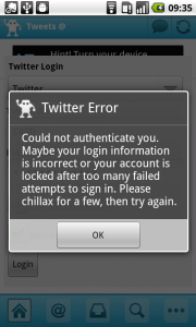
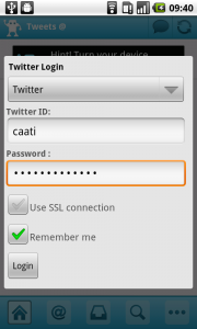
Twidroyd
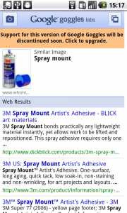
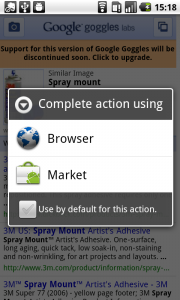
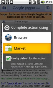
Google Goggles
