It’s been almost a year since Adobe announced it would no longer be updating Fireworks for future software releases. Fireworks has always been our ‘go to’ design app, one we have used with great enjoyment. But it is also in our DNA to evolve and constantly try to improve our workflow and methodology. It’s time for something new.
It has also been about a year since we’ve had some of our Interaction and Visual designers working in Sketch, with great pleasure. Which is why, in this post, we have listed some of the similarities and differences between Fireworks & Sketch.
Spot the difference
-
Infinite canvas
Having used Fireworks for so long we have gotten used to creating new pages for all design iterations. This is a different paradigm compared to Sketch. In Sketch you start with an infinite canvas on which you draw multiple ‘artboards’. You then draw your designs on these artboards. We make variations on our designs by creating multiple artboards on a single canvas. This helps in keeping a clear overview while staying in a single page. -
Iterate
Using the infinite canvas in Sketch stimulates to iterate your designs. By taking it one topic at a time and putting the different designs side by side we can keep the overview for a specific flow. This methodology allows us to have a visual map of all our designs, which in turn is useful to refer back to in the design process that follows. -
The interface
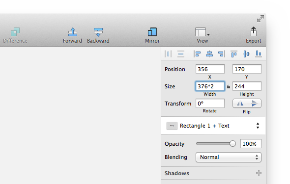
A huge difference is the interface. By default Adobe Fireworks shows a lot more panels and functionalities than Sketch does. This is one of the reasons which makes Sketch feel a bit more simple/straightforward. Where Fireworks requires you to click through a lot of buttons and functions to edit an object, Sketch presents you with a simple panel at the side of the canvas which provides the same functionality. It is the fact that this panel is contextual to the task you are working on that defines its simplicity. This makes it very enjoyable to work with. It gives live feedback and always provides enough control without cluttering the interface. The properties panel even allows users to do calculations, how useful is that?
The inspector can do calculations -
Smart defaults
Defaults are useful, especially in the heat of battle. Fireworks’ dropshadow defaults to 315° and 65% which isn’t very useful since no one actually uses those settings in their designs. Sketch improves on this functionality with better defaults. Moreover, when creating a grid one always has the possibility of using a standard 960 grid. In every aspect you can notice that Sketch has been made to provide in the needs for contemporary designers: artboards have default sizes for iPhone, iPad or a responsive website. There are however also some negatives: the default arrows in Sketch are not very pretty to behold. - Symbols
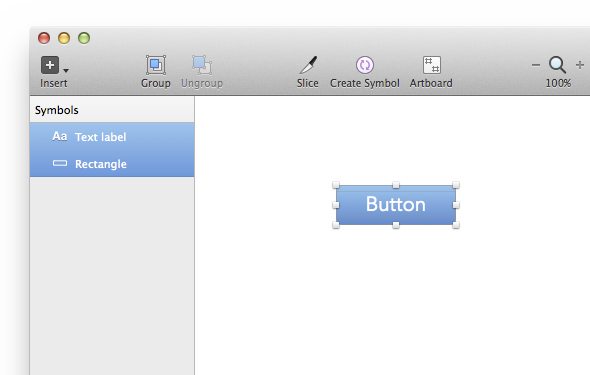
One of the reasons why we have always been very happy with Fireworks is the Symbols functionality. The ability to duplicate an element and having all of them change when only one instance is altered is very useful. Sketch also supports symbols (since V3). Sketch adds onto this functionality by giving you the possibility to exclude the text from a symbol, which allows you to create multiple buttons with one symbol while having different labels. The management of the symbols is also done in a useful manner.
Select an object and click ‘Create Symbol’ in order to make a new symbol -
Exports and slices
We have always found the creating and managing of assets to be pretty easy in Fireworks. Exporting and creating slices was pretty straightforward process. Sketch however surprises us by its simplicity and its ability to bring this process to the next level. When creating a layer from a slice Sketch allows you to export it in different sizes. Moreover you can define the naming convention for every individual export. Not only useful when working with retina, non-retina and Android devices but helps in keeping a clear overview as well. -
No TAP yet
One of the primary reasons we used Fireworks was our in-house developed prototyping tool. We used it for fast prototyping of clickable prototypes for apps. Unfortunately this is not yet available for Sketch. There are some other methods though, one can use d3.js or Invision. Regrettably these require a little bit more effort to use than TAP. -
Stability
‘Fireworks has crashed’ is a phrase heard often and one of the major complaints concerning Fireworks. You can even find a specific group on our Yammer network with the sole purpose of being an outlet for this exact problem. And although Sketch has its bugs and isn’t perfectly reliable, in 90% of the time it restores your design after a crash. A relief to say the least! For Sketch updates are common and the team from Bohemian Coding is working continuously on improving the product. They also listen to your feedback.
Clients and Sketch
Given the fact that Sketch is a relative new product, especially compared to Fireworks, we have noticed that it isn’t being used at some of the places we regularly visit (It’s only available on Mac). This means that some coordination with the client is necessary whenever it is time to transfer sourcefiles. Not a real problem for us as we are just as capable in Fireworks or Photoshop.
Sketch can also be very useful be very useful to keep track of all design iterations. Just copy some exports to Sketch en organise them in a useful manner. This way you can keep overview of all designs whilst keeping the workflow simple.
How to start using Sketch
Although it can be a stressful experience to force yourself to use new software it might not be a bad idea to try. It might be a good idea to start by recreating something that already exists, maybe a nice app for example. This allows you to forget about the design for a second and just focus on getting comfortable with the software making it a little easier to start with new software. It’s how we started anyway. Most designers find Sketch pretty easy to get used to and the time you’ve spent getting to know a new tool will pay for itself.
Pro-tips
Here are some of our pro-tips to help you get started in Sketch:
- Sketch Mirror (€4,49) – Mirrors your artboards directly on iPhone or iPad.
- Hold ALT to show relative distances.
- Quickly export a layer by dragging it to your desktop.
- Use the Presentation mode (CMD + .) to go fullscreen when showing your designs to others.
- Press CTRL + C for a color picker.
- Is it getting a bit too much? Use Sketchshortcuts for an overview of all shortcuts.
Summary
It is Sketch’ simplicity which defines its power and beauty. The defaults have been carefully thought out and support your workflow. This keeps the interface to a minimum and makes sure that it never gets in the way. Even though there are lots of differences between Sketch and Fireworks, that doesn’t mean that one is necessarily better than the other. It is a simple fact that Fireworks has become an end-of-life product and that we always try to find ways to better our workflow. Getting to know new software is never a bad thing and Sketch happens to be very consistent with our work methodologies. It is of course not the only tool we work with and there is plenty of space left for more, which is why we celebrate the development of tools like this!
What are your thoughts on Sketch? Please feel free to share them with us and let us know why you are willing (or not) to work with Sketch.


