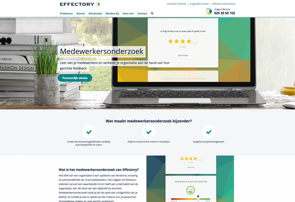
Effectory has specialized in conducting employee research and approached us with a special task. They asked us to create a website that would fit the image of a challenging international leading company, with people who are passionate about their work. After three months, we delivered a great looking new website.
The challenge
The old website of Effectory did not fit their criteria anymore. Their product portfolio would expand short term, but the website did not provide the right possibilities for this to happen. Also, the responsive behavior did not match the user’s needs and visitors got lost in all the information. Besides this, Effectory also really wanted to show the company’s culture. It all sounded like a challenging task!
Kick-off
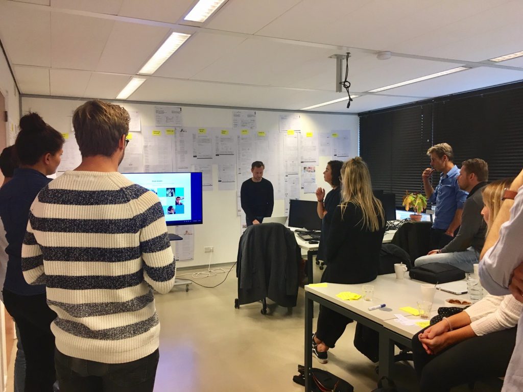
Like we do with a lot of projects, we started with a kick-off. This does not only provide a clear briefing on the project, but it also gives all stakeholders the opportunity to give input.

After working closely together with two of Effectory’s product owners and the development team, we were able to deliver a fully redesigned website in only three sprints. At the end of each sprint, we invited all stakeholders to collect their feedback.
Enthusiasm & culture
One of Effectory’s wishes was to highlight their own, unique culture on the new website. We took inspiration from their employees: these young and enthusiastic people show the company’s culture in the best way. This is why we chose to use a lot of photography: now you see pictures of employees throughout the entire site. Also, Effectory’s get-togethers, which give a great impression of the company, are featured in imagery.

Combined with the use of photography, we made the website a lot more modern by using white, which gives a much fresher look. We also used a more readable font and added illustrations to improve recognition of product categories and vacancies.
From maze to overview
An important part of the website was Effectory’s product portfolio. The number of services Effectory provides was about to expand to nearly 30. The old structure showed all products in the main navigation, providing no information at all. By taking away all separate items and adding an overview page where needed, we can now show the right information at the right time. And by clustering and showing introductory information, we ended up with a clear portfolio overview.

What did Effectory think of this project…
Cooperating with UNITiD was very inspiring! In just a few weeks time we created a completely new website with a well thought out interaction design and a modern visual design, which matches our company. Using the scrum method made everything go very fast but still provided enough time to make the right decisions. We are very happy with the result!
Keeping in mind any future expansions of the site early on in the design process, Effectory now has a site that is easy to maintain. Do you also have a project that you want us to collaborate on? Let us know!
Check out Effectory’s brand new website or take a look at our other portfolio items.


