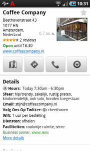
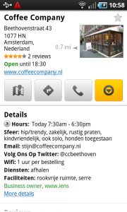
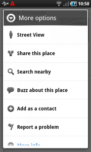
Toolbar
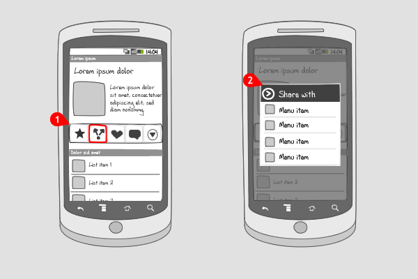
It works like this:
-
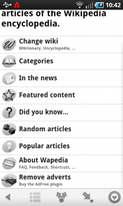
A toolbar can take up to 5 buttons that can perform actions in the current activity. The toolbar can appear everywhere in the screen, where it has a fixed position, by scrolling the toolbar can move out the screen. The buttons in the toolbar contain icons only. On pressing a button in the toolbar, here to share the content displayed above it…
-
…a dialog pops up with options the user can choose to share from, or cancel by pressing the back-button.
Use when
A toolbar can be applied when you want to give the user an easy way to perform multiple actions in a certain context. Instead of putting the actions in the options menu, you can reserve a horizontal space somewhere in the screen, that fit up to 5 buttons. When you have more options to distribute from the toolbar, make the rightmost button a more-button.
You should not use a toolbar to switch to a different view or mode in the application. For that you should use a tab bar instead.
The Good
- The user can quickly choose the action he wants to perform
The Bad
- Because of the fixed position in the page, the toolbar can be scrolled out of the screen, which makes it not visible anymore.
Examples
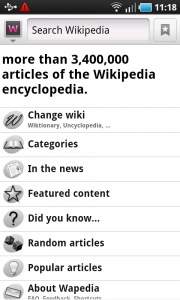
Wapedia
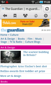
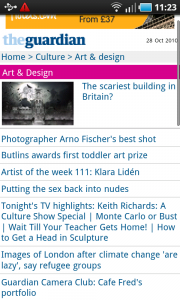
Skyfire Browser
Google Places
