Spinner
It works like this:
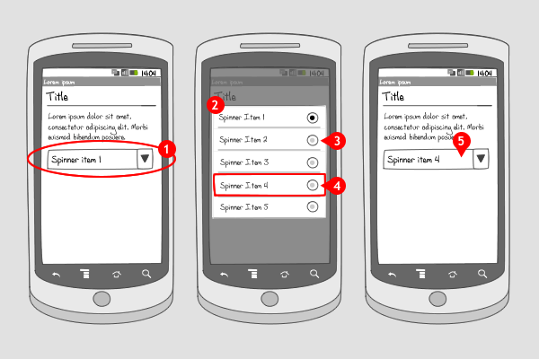
-
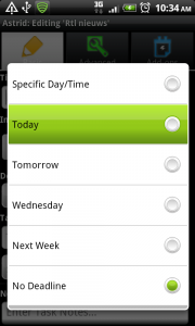
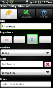
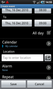
A spinner is similar to a dropdown list. It holds a list of items, from which the user can select one at the time. The selected item is displayed in the text box. The right side of the spinner shows a selector, by which the user can identify the spinner. When the user selects the spinner…
-
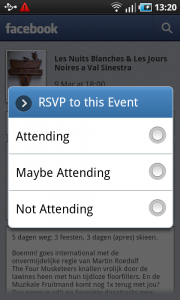
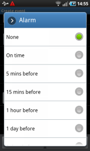
…a dialog appears over the current screen, displaying all the child items in the spinner list. Every item in the list is accompanied by a radio button.
-
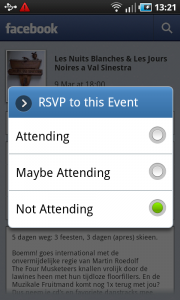
the previously selected item or default item is selected. It also happens that no item is selected.
-
When an item is selected, the dialog disappears…
-
… and the selected item is displayed in the spinner element.
Use when
A spinner can be used if a user has to select an item from a predefined list. Use a spinner if there's not enough space to display the entire list of items. Spinners are frequently used in in a 'settings' screen, in combination with elements for getting input, like radio buttons, checkboxes, and time and date pickers. Radio buttons are used in a spinner to indicate only one single item can be selected.
The Good
- Saves valuable screen estate
- Presents predefined choices, helps users make a choice
- Spinners are useful for *quick* input of *accurate* data. (Michael Martinez)
The Bad
- Spinner items are only visible when tapped
- Spinner dialog obscures the screen and context, might confuse the user
- Does not allow input of custom values
- Tricky to implement in some situations, I.e. Doesn't "just work" out of the box. (Michael Martinez)
- Before the user makes a selection, the first element is shown in the spinner. This leads many coders to reword the 1st element as \"select? (Peter van der Linden)
Examples
Astrid
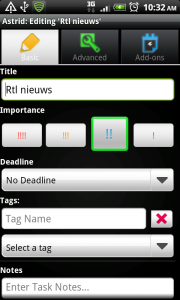
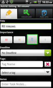
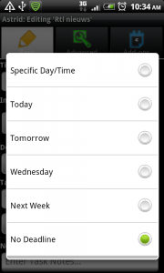


Calender

7 Responses to Spinner
It’s hard for us to asses difficulties in implementation, since we have no experience with coding. We’d love to hear other people’s opinion on this!
It would be nice to have a recommendation for how many items are too many. For example, I was considering using this to choose what state you live in, but I’m not too happy about having 50 items to scroll through.
A spinner in a dialog isn’t too hard to implement, I think it can be done in a few lines.
Take a look here: http://developer.android.com/guide/topics/ui/dialogs.html#AlertDialog
For popup select dialogs used with Android comboboxes (aka spinner components), remember the following:
Use the stock single select list dialog. It has several optional configurable elements:
o It’s a good idea to set an icon. Use the stock Android “More” icon, which connotes “here’s a list of options.” (That icon has been skinned at the OEM level on the Samsung Galaxy S screenshots shown above.)
o It’s a good idea to use a dialog title to provide context and remind the user what they’re supposed to select. The label value of the field is best.
o For a combobox (spinner) control, turn on the radio buttons in the options list. Be sure that the current value is shown as selected when the dialog loads.
o Specify that the selection of a list item dismisses the dialog and selects the value, if different.
o For a single-select radio list dialog, you may optionally display the stock “Cancel” button on the dialog. It’s generally a good thing to do.
“Interactive Single-Select List” variant….
Note that Android has an *interactive* single select options list dialog variation. This variation is used for use cases where the user would like to interact with a value before committing to it.
The best examples are the ringtone and alert tone dialogs.
This variant differs from my above post on a regular single-select list dialog in the following ways:
o Specify that the selection of the list item (a) highlights the selected item, and (b) triggers the interaction. For example, in the ringtone dialog, the phone plays the selected ringtone, but does NOT dismiss the dialog.
o Specify that the dialog display both the “OK” and “Cancel” buttons. Selecting either button dismisses the dialog. Only the selection of the “OK” button commits the new value.
How do you create an easy search spinner with countries? You know that there are more than 100 countries and if I want to set “Zimbawe”, is too uncomfortable. Please, help me!
A spinner will not be a good solution for your problem. You can better put all the countries in an alphabetically labeled list, through which you can scroll like you scroll through a list of contacts.