Slider
It works like this:
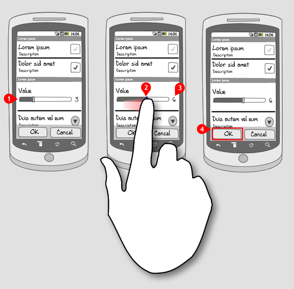
A slider displays the range between which the user can choose a value. The at most left value is the minimal value, the at most right the maximal value.
-
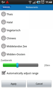
The slider consists of a horizontal strip divided into two parts by a control. The left highlighted part corresponds with the value that’s currently selected. The right part shows how much room the user has to adjust the value.
-
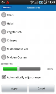
When the user slides the control to the right, the left highlighted part grows…
-
…and the corresponding value is displayed (this is optional), or played when the value concerns a sound volume.
-
To confirm the new value tap OK
Use when
The slider is applied usually in a set up view, where the user has to enter a value for something, like a distance or a sound level. The user can make a choice throughout a (wide) range of allowed values.
When there are just a few options available to choose from, consider using radio buttons or a spinner.
The Good
- It's a very intuitive way of entering a value for something and easy to understand
- It's fast
- It's fun
The Bad
- When the range of values is big, it's harder to enter an exact value.
- The cursor is hidden by the finger. The visual feedback is none for small changes. (NicolasG)
Examples
Clock - Set alarm
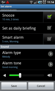
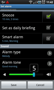
Layar - Filter settings
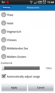
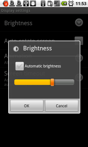
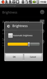
Nexus One - Display settings
2 Responses to Slider
On using slider I find it hard to get the correct number for larger sets of values. For this I use plus and minus buttons on either side of the slide allowing the user a finer step of control over the slider value.
I have a custom component that has a plus and a minus button ot the left and right, and in the middle there’s an EditText that accepts only numbers and has a default value. This way the user can type the value he/she wants, and there’s there are the plus and minus buttons for tuning. Also the buttons increase and decrease the value every 0.05 seconds by one if the user holds down one of the buttons.
It looks like this: http://tinyurl.com/694vws9