Sliding Layer
It works like this:
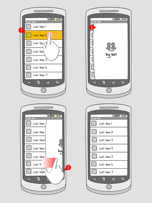
-
After a certain trigger (button click, item selection, etc)
-
A sticky container will slide from any side of the screen to a certain centered position in order to get the visual focus of the user. It’ll remain stuck to any of the side of the screens.
-
This container shall be dismissible/closable by swiping it away or optionally by tapping in any empty space within it.
Use when
An accessory container to show extra information is needed and a new view / activity is too much or undesired interaction. Works best if the content in the layer is low in complexity.
The Good
- Easy to use
- Better interaction experience
- Context remains visible
The Bad
- When the content is too complex it might be overwhelming
- Ways to dismiss the layer might not be obvious without explanation
Examples
Google+

1 Google+ displays an icon for notifications in the actionbar
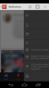
2 When tapped, a layer with notifications slides in from the right
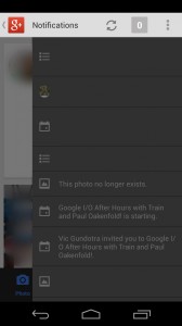
3 The layer sticks to the right. It can be closed by swiping right, or tapping the notification icon again
Wunderlist
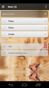
1 In Wunderlist, details for tasks can be opened by tapping the specific task
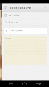
2 A sliding layer allows users to view and edit details for a new task
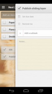
3 The layer can be dismissed by swiping it to the right
One Response to Sliding Layer
6 Wunderkinder just open-sourced a library to include this pattern very easily in your Android app:
https://github.com/6wunderkinder/android-sliding-layer-lib