Rating – Stars
It works like this:

-
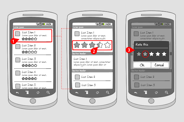
For each item, a rating of (usually 5) stars is displayed. This rating is the average of all ratings given to the item.
-
In a detailed view for the item, the possibility for rating is shown. From left to right the rating is shown by highlighted stars. Notice how the rating doesn’t have to show completely highlighted stars, but also half highlighted stars to add more nuance to all ratings. When the user taps the stars…
-
…a dialog appears for rating the item. The user can assign a number of stars by tapping them, and save the rating.
Use when
Ratings can be used when you want the quality of content to be judged by its users. The amount of stars given by other users matters when the user has to make a choice for downloading or opening an item. A high rating (a lot of stars) will persuade the user more likely to make the download. Usually, 5 stars are used to give a big enough rating range. As explained above, the displayed rating can also show half highlighted stars. Don't forget to add the number of ratings somewhere to make the rating actually valuable. An other way to let users give their opinion on items is by liking or disliking or commenting.
The Good
- It's a quick way for users to add a rating
- Adds value to your app's content, because the user gets involved in giving his opinion.
The Bad
Examples
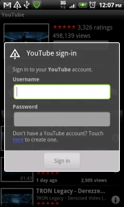
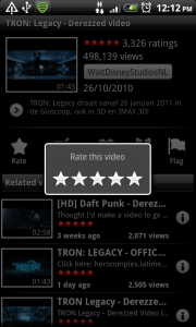
YouTube


4 Responses to Rating – Stars
Should it be possible to rate zero stars? i have that problem in iPhone application and i solve it by making it possible to slider the starts and if you slide outside in the left side you rate zero. But it is not intuitive.
Maybe we can add a “NO” sign in the left to tell the user you can clear the stars? But it will looks ugly, though.
Solution: – and + signs before and after the stars.
This can increase and decrease the value in increments so that even half star ratings can be acknowledged and thus also enable the 0 star evalutation.
+ and – buttons are gigantic — use more vertical space and add an ‘okay’ or ‘rate’ button so if user presses okay/rate -> no stars are used.