Use when
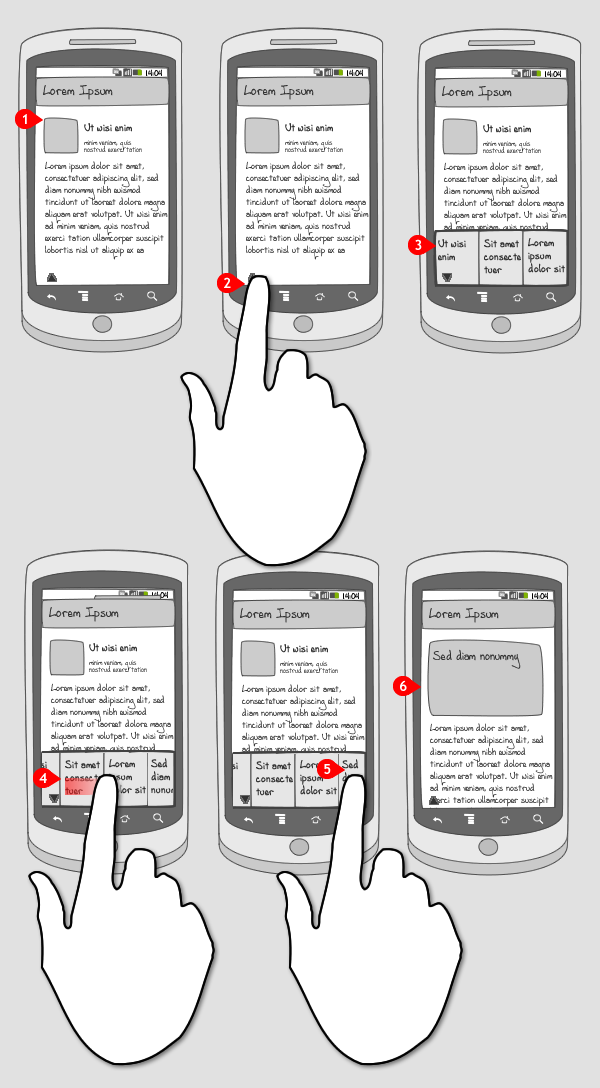
Typically used in news applications so that users can jump easier from one article to another and don’t have to go back to the main list of articles. But it can be applied in all types of applications in which content is organized.
When you want the user to move through content in a linear way, it is better to let him go through it by stepping.
The Good
- Avoids users having to go back to the main list of articles and directly go to the next article.
- Keeps the user in the context of the current article
The Bad
- In terms of the number of interactions it is the same amount of actions as going to the main list first and selecting it. So no real ‘gain’.
- You can’t really show many articles this way. Only the next two articles can be displayed.
Examples
Androidworld

1 The app of Dutch Blog Android World contains articles that can be read without moving back to the overview of articles.

2 When the user taps the menu hard key, the contextual navigation slides in from the bottom, containing images and header of the articles that are available too. Because the current article is the last one that was posted on the blog, it is the first and at most left in the carousel of the contextual navigation. It is not highlighted though, which is recommended, because than the user doesn't have to read the headers to know which article is selected.

3 When the user scrolls to the left more articles slide into the screen.
Pulse

1 In News reader Pulse the contextual navigation derives naturally from its homescreen, where horizontal rows with articles are placed in a vertically scrollable list.

2 When the user taps on an article, it is opened and can be read. In the bottom left corner, a label is visible which corresponds to the horizontal row with articles from the home screen.

3 The label can be tapped, which makes the contextual navigation slide in from the bottom. The article that is being viewed, is selected by a thin blue line.

4 The user can scroll to the left to view more items in the row. Where he puts his finger, the item is also selected.
Evernote

1 in Evernote the user doesn't have to move to the overview of notes when he is viewing a note by pressing the back button.

2 The user just has to tap the screen, and an indicator appears, pointing up.

3 When the indicator is tapped, the contextual navigation slides in from the bottom, containing previews of the notes that are saved earlier.

4 The user can scroll horizontally through the row of items.
2 Responses to Contextual navigation
I liked this pattern. +1
tks a lot