Context Menu
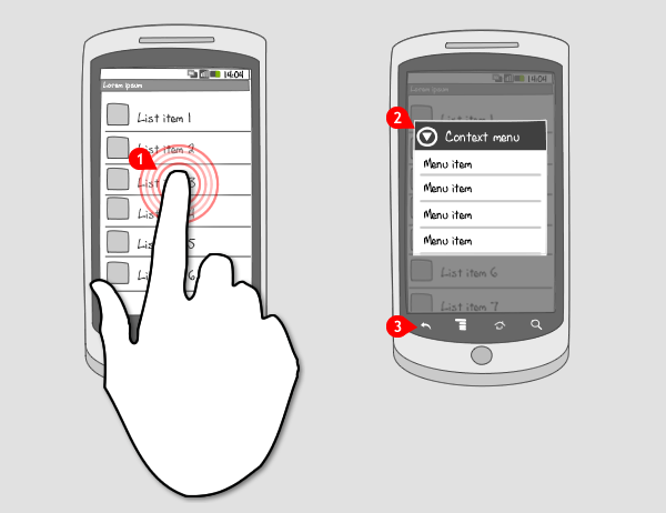
It works like this:

-
When the user performs a longpress on a specific item in a view…
-
… a context menu, or also known as longpress menu, opens as a floating list of items from which the user can choose to perform an action…
-
… or cancel by pressing the back-button.
Use when
The context menu is like the right-click context menu in windows systems. It contains functions the user can also find elsewhere. When you want to provide the user with a shortcut to frequently used commands that can be performed on an item, you can put those commands in the context menu.
Use the context menu only when the commands apply to the pressed item. The commands should be sorted by relevancy from top to bottom, starting with the most relevant at the top. This is usually the option that would be performed on normal touch of the item.
When there are multiple visual targets per item you want to have options for, consider using quick actions.
The Good
- Provides a shortcut for frequently used options
- Works intuitively: perform an action on this specific item
The Bad
- User has to discover that there is a context menu. There is no visual cue for that
- Takes away focus of current activity - might be disorienting for users
- Context menus can take up large lists of actions
Examples
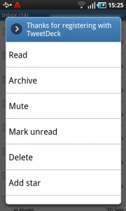
Gmail


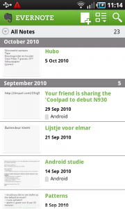
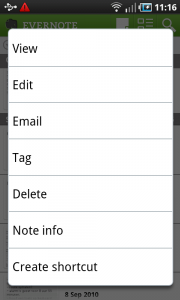
Evernote


One Response to Context Menu
Now Google recommends using a contextual action bar instead of the context menu, correct?