Use when
The 'swipe for action' pattern has not been applied in many apps so far, but it provides a nice and quick way to let the user choose an action he can directly perform on a certain item. The actions that are taken up should be the most important and obvious ones that can be performed on the item.
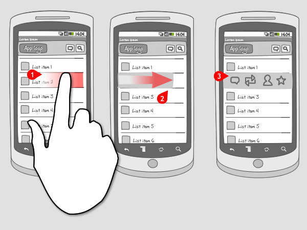
This pattern can exist in two forms. The first is explained in the wireframe: after swiping, the user can choose to perform an action by tapping on an icon. The second kind is when the action takes place directly after swiping over the item. The second set of screenshot examples show how this kind works. The user can swipe over the item in both directions. It is possible though, that the action that is performed after swiping is different in both directions.
Because of the contextual character of this pattern, you can also let a long press gesture instead of swiping, invoke the layer with actions.
The actions that can be called for on swipe, need to be contextual to the selected item, and cannot be global to the current screen. For that you should put actions in the options menu. Or, when the item was tapped and displayed on a detail page, actions can be added to a toolbar.
Instead of swipe for action, you could also use quick actions, or a context menu, but the latter is definitely less 'fun' or quick.
The Good
- It's fast
- It's fun
- When the user gets acquainted with it, he will be seriously engaged and perform the gesture all the time
- Hello! Very good job(this site)! Thank you man. (JohnBush)
The Bad
- It's very hard to discover, because of the absence of a visual cue
- The item that is swiped over gets covered by a layer, so it could confuse the user which item he just selected
- It may take a while for users to get acquainted with it
- The user doesn't know which actions can be performed before he swipes over the item
- The object has to be big enough to perform a swipe over it. (Alex Debkalyuk)
- it\'s not that\'s trival to close the context menu, you have to click the Back key (cheng)
Examples





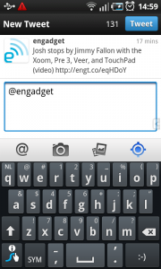
Samsung Galaxy S - List with contacts


10 Responses to Swipe for action
That’s a great pattern. I believe that in a not so distant future people will recognize this easily. But before that a visual cue is necessary.
I think for swipable material there should be a coloured tab on the right hand side or a little |> arrow on the right showing to swipe, if that makes sense
I think this pattern is more about iOS than Android. Android users use to longpress items to show a context menu, see http://www.androidpatterns.com/uap_pattern/context-menu
@Giovanni You’re right about that. The Twitter example originally came from Twitter for iPhone. I don’t agree however that it’s not about Android. The nice thing is that Android can embrace all new kinds of gestures and patterns, coming from other operating systems. This pattern is a great and fast way to perform contextual actions. And the longpress will still be available.
The problem I see with this gesture is once you make it, the “call” option appears with no indication on the user you swiped on and about to call. A call to action phrased “Call Joris Van Heukelom” (with the full name as it appeared before the swipe) would be much better.
@Giovanni: I hate looooongress..
About the swipe menu, it would be better if the options fell out below the item with a common border to show that they belongs to each other.
The companies should invest in hiring an UI and usability expert, just my one cent.
@Giovanni, @caat: Actually, I think that swipe pattern is related to webOS, the Palm/HP OS. It is implemented all over the core functionalities.
Share the code as well
Since there is no public implementation of that I will publish my work on that,
Check this post: http://stackoverflow.com/questions/7398184/twitter-for-android-like-swipe-to-side-quick-menu/7462204#7462204
There patterns are useless without tested, working, open code.