Expanded options menu
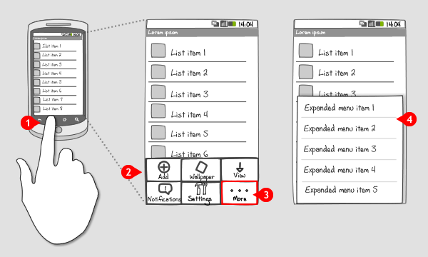
It works like this:

-
When a user presses the menu-button, the Options menu slides in from the bottom The Options menu contains commands that are global to the current activity, or can start an other activity.
-
The Options menu consists of 1 to 6 buttons containing an icon and title. The icon is used to identify the option, the title as support. The options should be sorted by relevancy from left to right & top to bottom, providing the most relevant option first. The icons in the menu can be arranged on a 2 by 3 grid or a 3 by 2 grid.
-
When you have more than 6 options to distribute from the Options menu, make the 6th button, i.e. in the down right corner, a more-button.
-
Pressing the more-button opens the Expanded menu, which slides in from the bottom and replaces the Icon menu. The Expanded menu displays a list of menu items in text only.
The Expanded menu is closed directly by pressing the menu-button or touching the screen outside the menu. The user can return to the Icon menu by pressing the back-button.
Use when
Your Options menu has more than 6 options that can be assigned to the current activity.
The Good
- Keeps less frequently used options from cluttering the screen.
The Bad
- Requires an extra step to access options that are in the Expanded menu.
- The user has to guess which options are in the Expanded menu.
- Doesn\'t have icons (Alexey)
Examples
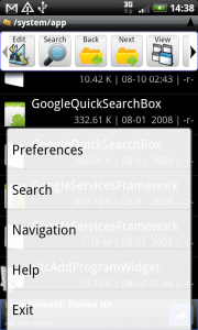
Astro
![]()

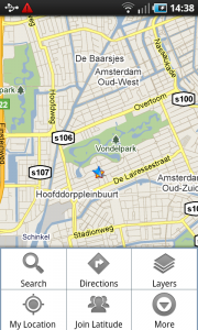
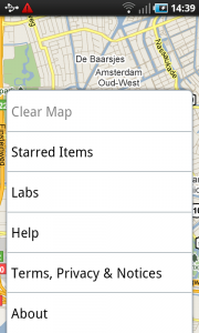
Google maps


One Response to Expanded options menu
This is the old design; nice to see it sometimes. The new design uses the menu on the action bar, and the overflow button as the Menu-button for devices which has a physical Menu-button. Devices without the Menu-button has an overflow (or “more”)-button to the right of all actions.