At UNITiD we love to work with beautiful tools that improve our workflow. We recently started working with this new tool called InVision to find out if it could replace some tools we work with at the moment. InVision is a prototyping, collaboration and workflow tool for digital designers.
InVision is not a primary design tool – you use it to share your screen mock-ups created in other tools like Fireworks or Sketch (you can read our post on Sketch here). It means that to use it effectively, you will need some planning and coordination upfront. InVision is most suited for receiving collective feedback from (multiple) remote stakeholders. Building click-through prototypes is a secondary feature, but is nevertheless very quick and easy to use.
We would like to share some of our first insights and provide you with some tips to give you a head start when using InVision.
General
-
Is the project suited for InVision?
InVision is best suited when you want to work closely with your remote client (and vice versa). You can discuss screens and/or flows easily and you’ll be ensured the client is looking at the most recent screens. InVision is less suited if you want to communicate responsive behavior or a lot of in-page transitions. If stakeholders don’t want to give their feedback digitally (because they are too busy or do not like typing their feedback) InVision might also not be the best solution. -
What other communication channels are utilized?
Discuss beforehand what other remote- and face-to-face communication channels will be used. For example are you transferring (source) files through Dropbox or Google Drive? Are you also using Basecamp or Jira for discussions and/or asset deliveries? It is important that everyone involved knows which tool to use for each task. -
What is/are the role(s) of stakeholder(s) in providing feedback?
You can easily set restrictions on the InVision Project, so decide in advance which stakeholders are allowed to review and which ones are allowed to view-only. -
What will be communicated on InVision?
Which fidelities (visual, functional, content) are shared? Decide whether or not to mix fidelities on one page / in a flow of pages or show different fidelities separately. -
How will you structure your InVision Project?
Are you going to deliver a click-through prototype or static screens? If you’re building a prototype decide upfront which interactivity to show. How are you going to handle and communicate changes? InVision provides a great built-in feature to view version history of a page. This works great for small changes, but is less ideal when entire pages change or when considering design alternatives. Will your structure of the prototype allow stakeholders to show the ‘Overview of Pages’? If not, like in prototypes with multiple scenarios in complex forms, reserve space for an image with a Wayfinder (flowchart or sitemap). -
Who will upload files – only interaction designer(s) or visual designer(s) or both?
If multiple disciplines are allowed to upload files, decide who will be in lead of consistency and sharing settings. -
How will you use page-naming?
You’ll replace/update screens continuously,so you’re stuck with the page name you came up with at the beginning.[edit] You can manually drag a page with a new name onto the old one and it will take on the new filename. Start with naming conventions for unique pages, templates, components and styles. Align them with your front-end and back-end developers.
Communicating & Sharing
-
Determine your communication channels, protocols and planning
Confirm them face-to-face or in writing. Decide who will need access to the InVision project and with what rights. Also determine who’s feedback is leading. -
Decide what will be communicated on InVision
What is expected, where are feedback icons placed (close to element, but not on top of it). If somebody else already commented on an element, add your comment in the conversation, not a new one next to it etcetera. -
Introduce concept of Feedback Rounds
In a standard workflow the feedback stream is continuous without clear feedback rounds, which could be very difficult to manage. Especially if you contractually set a number of revisions. Therefore we recommend to introduce a Feedback Rounds protocol.Example protocol 1 ‘Weekly Round’: On each Friday morning – official “release” with all feedback incorporated. Then feedback is allowed in continuous stream ‘till Wednesday end of day. Designers can react ‘till Tuesday end of day, but are not expected to (depends on pace and budget). Thursday is freeze for feedback – designers incorporate all feedback. Friday morning – new “release”, consider all files changed. Add a version number on every mock-up image (in your designtool) and not only on the screens with changes.
Example protocol 2 ‘Single approver’: Timing could be same as in 1, but with a single decision maker. Multiple stakeholders can comment, but only one stakeholder decides which feedback should be taken into consideration.
- Choose share options wisely
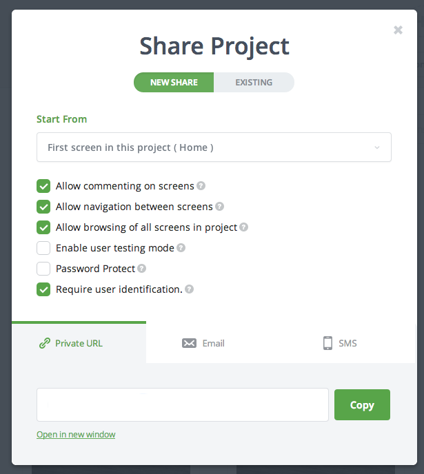
Choose the option where user identification is required. This way you’ll be able to see who reviewed which screens and therefore gives you more insight of what’s going on. Also decide whether your project should be password protected or accessible to anyone with a link.
Conclusion
InVision is a really nice and easy-to-use tool that makes collaboration easy, beautiful and fun. However, we did experience some flaws and are still missing some features we have gotten used to in other tools. But with their easy accessible feedback form at the bottom of every screen leaving feedback is a piece of cake!
If they keep going at their current pace, we can be sure InVision will come up with new and improved features soon. We have even received an e-mail confirming some of our ‘needs’ will be implemented soon. We can’t wait!
What’s your experience with InVision?
We would love InVision even more if…
-
you could see and read comments in build mode (and only add, respond to or edit comments in comment mode). Now we have to switch modes constantly to know whether or not there’s a comment on the screen.[Realized – Updated 28-04-’14] -
we could start discussions without a screen, like discussing schedules or progress for example. (InVision has let us know this will be a new feature soon)
-
we could add different screen resolutions and -orientations in one project. Now we have to make a ‘desktop’ and ‘mobile’ project or a ‘portrait’ and ‘landscape’ project for the same client/project. (InVision has let us know this will be a new feature soon)
-
we could work with different versions of a prototype within one project. At the moment we use sections for this, but when the client is allowed to browse all screens he gets lost easily. An elegant solution for versions and/or alternatives would greatly improve the workflow.
-
all the projects you work on are placed in your own folder (in the desktop extension). Now you have to remember who is owner of the project, ’cause the screens are placed in the owners’ folder.[Realized – Updated 28-04-’14] InVision now collaborates with Dropbox for a better syncing experience. -
if screens could be mapped in a sitemap or flowchart. Sometimes it becomes difficult to keep an overview of all the screens and states presented in one prototype. It would greatly improve communication with the client when these screens could be organised in a sitemap or flowchart.
-
an old link (previous version) of a prototype keeps working when screens are renewed. This way the client is able to compare different versions. See our current workaround with “Feedback Rounds”.
-
if the prototype tool is more extended. For example with time based screens, in-page animations like sliders and carousels and overlays.


Posted: 08:15 on 1 April 2014:
1 April 2014 on 08:15:
Though it’s good advice to use and stick with a naming system, you’re not stuck with the original page name. You can manually drag a page with a new name onto the old one and it will take on the new filename. This is of course a pain if you’re doing more than one or two, but it does work.
Posted: 08:24 on 1 April 2014:
1 April 2014 on 08:24:
Thanks for the tip Toby! We didn’t know that. That could be handy sometimes, but is indeed not ideal if you’re dealing with a lot of screens.
Posted: 02:44 on 14 November 2014:
14 November 2014 on 02:44:
“if screens could be mapped in a sitemap or flowchart”
We create a sitemap as the first file in the project and use hotspots to link to individual pages.
Posted: 14:14 on 4 February 2015:
4 February 2015 on 14:14:
Nice tip, Leevi. What software do you use to create the sitemap? Do you have a way to go back to the sitemap from the individual pages?
Posted: 21:11 on 27 January 2015:
27 January 2015 on 21:11:
What a wonderful write up to find! I just wanted to mention that I have pulled your “We would love InVision even more if…” list into our feature requests area internally. I’ll be sure to reach out if we have any further need for clarification. But also please do feel free to ping me directly at stephen[at]invisionapp.com with any requests or questions! On behalf of the InVision team- thank you so much!
Posted: 08:51 on 17 February 2015:
17 February 2015 on 08:51:
Happy to see a great review of an app i’m using. the pros and cons are great and very detailed. i’ll bookmark this blog for more interactive and ui design articles. thanks!
Posted: 08:41 on 16 October 2015:
16 October 2015 on 08:41:
Hi there!
Im curious on the topic of managing different screen resolutions for i.e. a responsive website.
How do you set up your syncing process, or how do you manage your files anyway?
Best regards
Jeremy