At UNITiD we have gained quite a bit of experience creating responsive designs for websites and we developed methods to tackle large-scale responsive sites effectively along the way. We’ve done this for municipalities, banks and other companies who do not depend on advertising on their website.
Recently though, we have started work for a commercial client, for who selling advertising on their website is a vital part of the website. We took on the opportunity to tackle this issue as well; how do you deal with fixed advertising formats on a website with variable views.
Often for websites equipped with banner ads, these advertisements play an important role in the right to exist for these websites, as they provide an important revenue stream.
This can quickly lead to a situation where all decisions concerning the design are being dictated by the (im)possibilities of the banner ad formats and their positioning. To prevent the website to be completely dominated by advertising and to ensure that the content is still being done justice, it is important to deal with these constraints intelligently.
The IAB (Interactive Advertising Bureau) has been working on defining standards and specifications for banner ads for several years now. Many website owners therefor look at the IAB when in the process of defining their banner ad formats.
In the past year the IAB has published two draft proposals for so-called ‘Responsive Creative (RC)’; banner ads for responsive websites that fluidly resize according to the view of the website. Two methods for Responsive Banner Advertising are being defined, which they named STRETCH™ and SWAP™. A third method, observed on the web, we are naming FLOW, where not the banner ad but the content surrounding it reflows in a responsive manner.
SWAP
The SWAP™ method used standard IAB format banners which are being swapped out when a new breakpoint is reached. For example a Pushdown banner ad (970×90) gets swapped for a Leaderboard ad (728×90) as soon as aforementioned banner doesn’t fit in the layout defined by the new breakpoint anymore. This process can be repeated untill the smallest available banner ad format is reached; the Mobile banner ad (300×50). This method also works for other banner ad formats: a Large Rectangle (366×280) becomes a Medium Rectangle (300×250) after which it is replaced by a Mobile banner ad (300×50). Or a Skyscraper (160×60) gets swapped for a landscape format (468×60) to once again end up as a Mobile banner ad (300×50) in the smallest view.

Stretch
In the STRETCHtm method the banner is being scaled proportionally according to the view of the website. On one or several predefined breakpoints the banner ad gets exchanged for a smaller or larger version of the same ad to ensure a better readability.

Flow
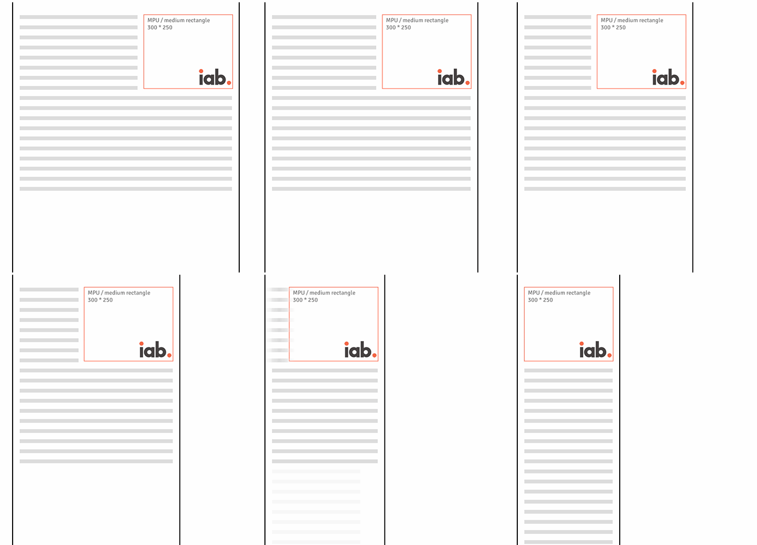
In the FLOW method standard format banner ads are being used. As the website’s viewport changes, these ads will retain their original size and the content surrounding them will ‘(re)flow’.
This only works well for banner ad formats who’s original size will also fit on the smallest screen resolutions. Often the iPhone’s non-retina resolution (320×640) is being used as a minimum requirement, and for this reason the medium rectangle (300×250) is the most common format being applied for this method. This solution works best for pages consisting mainly out of text. As soon as the website reaches a viewport where the content no longer fits (elegantly) next to the banner ad, the content will be placed either above or underneath.

Our implementation
In the aforementioned project for our commercial client, we ended up working with the SWAP method. The chosen visual style with an emphasis on imagery, combined with their desire to offer tailored mobile banner ads to mobile users, made the FLOW method unsuitable for this specific project.
The STRETCHth method was also considered, but didn’t make the cut as the advertisements auction system couldn’t support it (through these auction systems banner ad positions are being sold automatically to the highest bidder). On top of that banner ads are still being designed with a fixed format in mind. Resizing these images, often containing text and buttons, would currently bring too high a risk for undesirable results.
The best result would be reached when these banner ads would already take into account possible deformations in the design. Though this will bring with it additional work that could quickly render this method too costly.
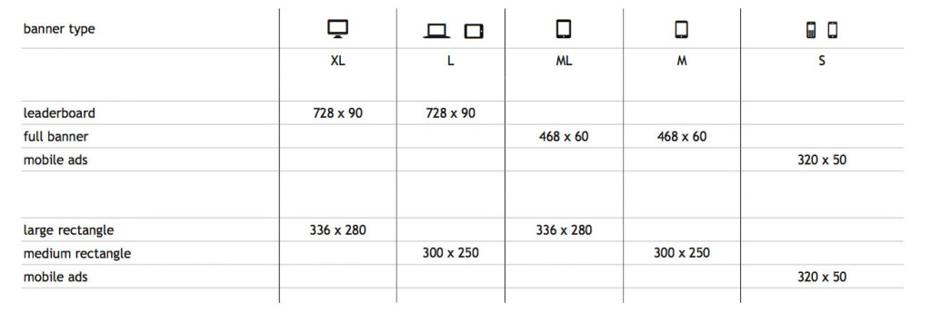
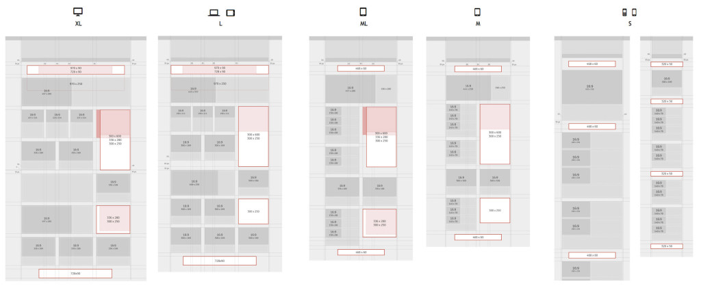
Based on the first wireframes, we defined several ad positions and for each breakpoint we determined which ad format they should be replaced with. The result is the table below showing how the various advertisement formats correspond to the various layouts, ranging from desktop (XL) to mobile (S).

On top of that, rules were established determining which ad sizes can be placed on a banner ad position. Every ad position has a maximum dimension that can be occupied, but when an ad of the largest format that would fit on that position is not available, a smaller ad may be placed. For instance the first ad position is for a billboard ad (970×250), but when not available (=not sold), a pushdown (970×90) or leaderboard ad (728×90) may also be placed. By allowing this we provide maximum flexibility in banner ad placement and we reduce the chance for empty advertisement positions to a minimum.

Should you encounter a project in which advertisements need to be integrated into a responsive website; carefully weigh the pro’s and cons of the various described methods. The ‘STRETCH’ method is the best fit for ‘fluid layout‘ responsive website, but is currently really only possible when you can afford the luxury to have advertisers create ‘custom creative’ (tailor-made advertisements). Does your website contain a lot of textual content, consider applying the FLOW method. Does your website have a fixed layout with clearly defined breakpoints, then SWAP is probably your best bet.
We are curious to find out which method you will apply. Advertisements within responsive websites is a relatively new phenomenon, along the way we will have to discover which methods work best for the various situations.
Currently the banner ads offerings are still quite rigid en is being dominated by standard formats that don’t play nice with dynamic layouts.
In the future new standards will undoubtedly be defined to support this. In the meantime we will continue searching for methods to elegantly integrate advertising into our websites.


