Expandable list
It works like this:
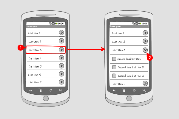
Items are organized in groups (often by category) in a two-level list. Groups can individually be expanded to show its children. Expandable lists are able to show an indicator beside each item, indicating the current state of the item:
-
collapsed or
-
expanded.
N.B. dependent of the device the indicators are positioned on the right or on the left side of the list item, and pointing in the collapsed state to the right or down.
Use when
Expandable lists are useful when content needs to be visible on the same screen. The content can be grouped in categories covering two levels.
When a group has many child items, consider using a drill down, to prevent extensive scrolling.
The Good
- Information can be compared more easily
- Save space, and focus on the first level of the Information. Although it\'s hard to compare the 2nd level information. (Borrys Hasian)
The Bad
- A lot of information is on one screen so scrolling is inevitable
- Information is not immediately visible unless lists are expanded. So it\'s hard to compare information at the secondary levels easily (Kirk)
Examples
TVGids.tv Nederland

1 The app TV-gids.tv Nederland can be used for browsing TV channels. Above a collapsed list of grouped channels.

2 When the user has tapped on a group, the list expands and the channels can be viewed.
RSS Feeds (HTC Desire)
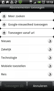
1 HTC Desire's RSS Feeds shows a list in a collapsed state with an indicator on the right.

2 Tapping on an item in the list, shows the expanded state of the item, with the indicator pointing down.
Browser (Samsung Galaxy S)
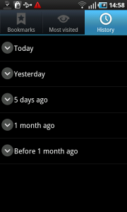
1 The browser history can be viewed in the collapsed state, in which the visited sites are grouped into periods of time. Notice that the indicators are positioned on the left side, and point to the bottom.
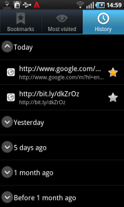
2 Tapping on an item opens the list of visited items.
One Response to Expandable list
Hi,
I like the concept of this design pattern. Where can I find a code example?
David