Recently Sonos updated their controller app for iOS and Android with a brand new visual style and some cool new features. Yet some usability issues remained, so we spent some time figuring out how to solve these.
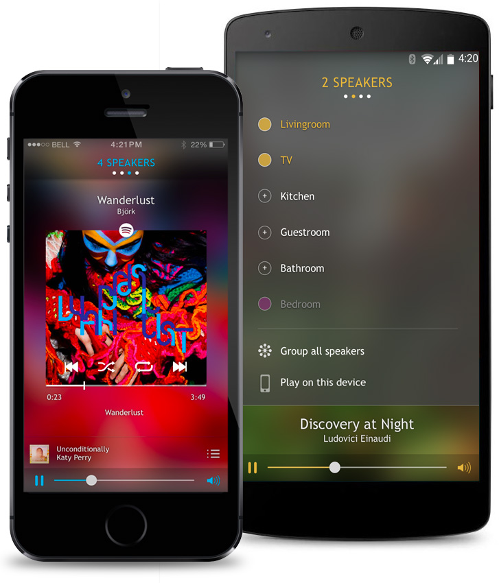
⧉ A visual representation of our usability improvements.
Since the app is the only way of controlling a Sonos system, its usability is crucial to the user experience of the entire product. We love our Sonos speaker system, but still tend to get frustrated with its app every now and then. For this reason we came up with 5 suggestons for improving the Sonos app.
1. Adopt a mental model
The biggest challenge with the Sonos app is a thing interaction designers call the “mental model”; the representation that a person has in his mind about the object he is interacting with. In the Sonos app, the concepts of zones (combined sets of speakers), speakers and queues are hard to grasp because of the way they are structured. This also leads to inefficient navigation patterns for often used features such as switching zones.
The Sonos app is structured around the “now playing” screen. This screen doesn’t show in any way that in fact there can be multiple queues, playing concurrently in different zones. The user needs to switch zones in order to get the idea of multiple queues. Unfortunately switching zones is tucked away in a separate menu. The fact that Sonos names zones as “Rooms” makes it even more confusing as rooms have physical boundaries, zones don’t; multiple rooms can make up one zone for example.
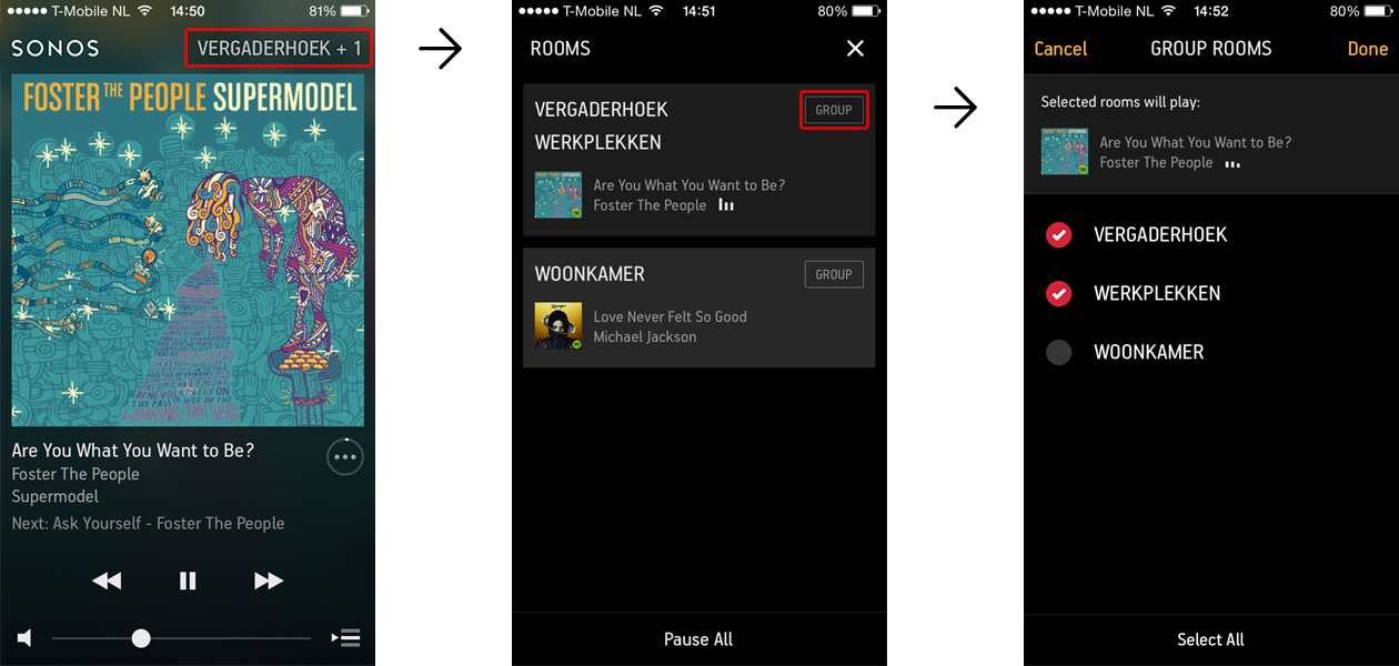
⧉ The mental model is difficult to grasp in the current app.
In our solution we quite literally laid out zones, speakers and queues in an almost tangible grid. Each zone is structured as a ‘column’ containing speaker management, “now playing” and queue components. Multiple zones are simply multiple columns. The ‘now playing’ component is still the central part; swipe left or right to switch zones and immediately see what’s playing. Swipe down to bring up speaker management. Finally swipe up to show and edit the queue for that zone.
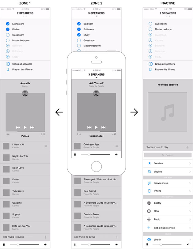 ⧉ Our design for a ‘grid’-like organisation of zones, speakers and queues.
► Press image to play animation
2. Simplify speaker management
In this new grid-layout, with zones sitting side-by-side in columns, it is much easier to understand what happens if speakers are added or removed from a zone. In fact we didn’t even change the way speaker management technically works, we just got the brain teasing “Rooms” concept out of the way.
Just swipe down and see in one glance which speakers are playing music in the current and other zones. Add speakers to the current zone and they are removed from other zone, or select an inactive speaker and a new zone with that speaker is automatically created.
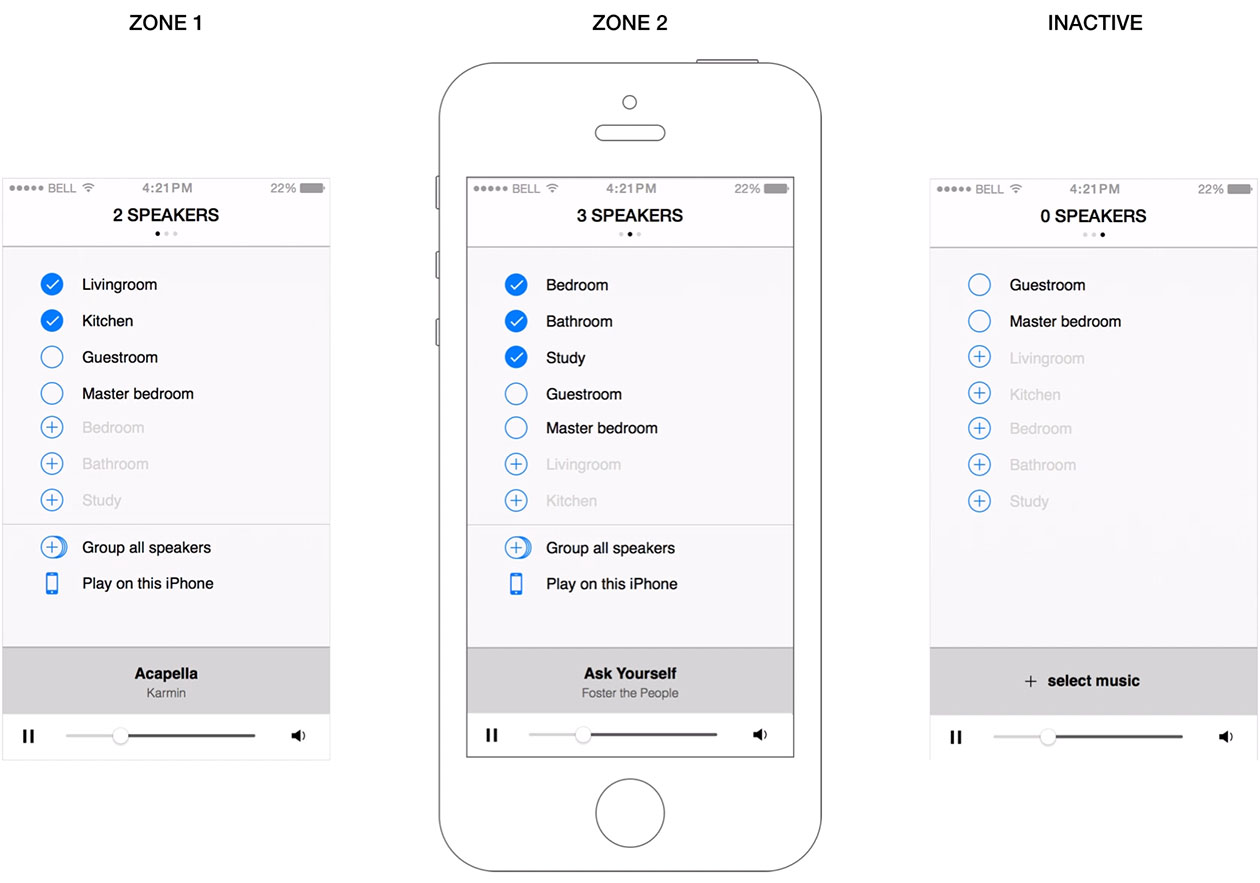 ⧉ A more straightforward speaker management pattern.
► Press image to play animation
3. Provide faster queue management
In the new grid-layout, the queue is only one upwards swipe away from the now playing screen. From here the queue can be reviewed and reordered, and new music can be added. From the search results view, tapping an item will immediately start playing it (moved to top of queue). A swipe right will add it to the bottom of the queue. Want more options? A longpress will bring up the full options menu.
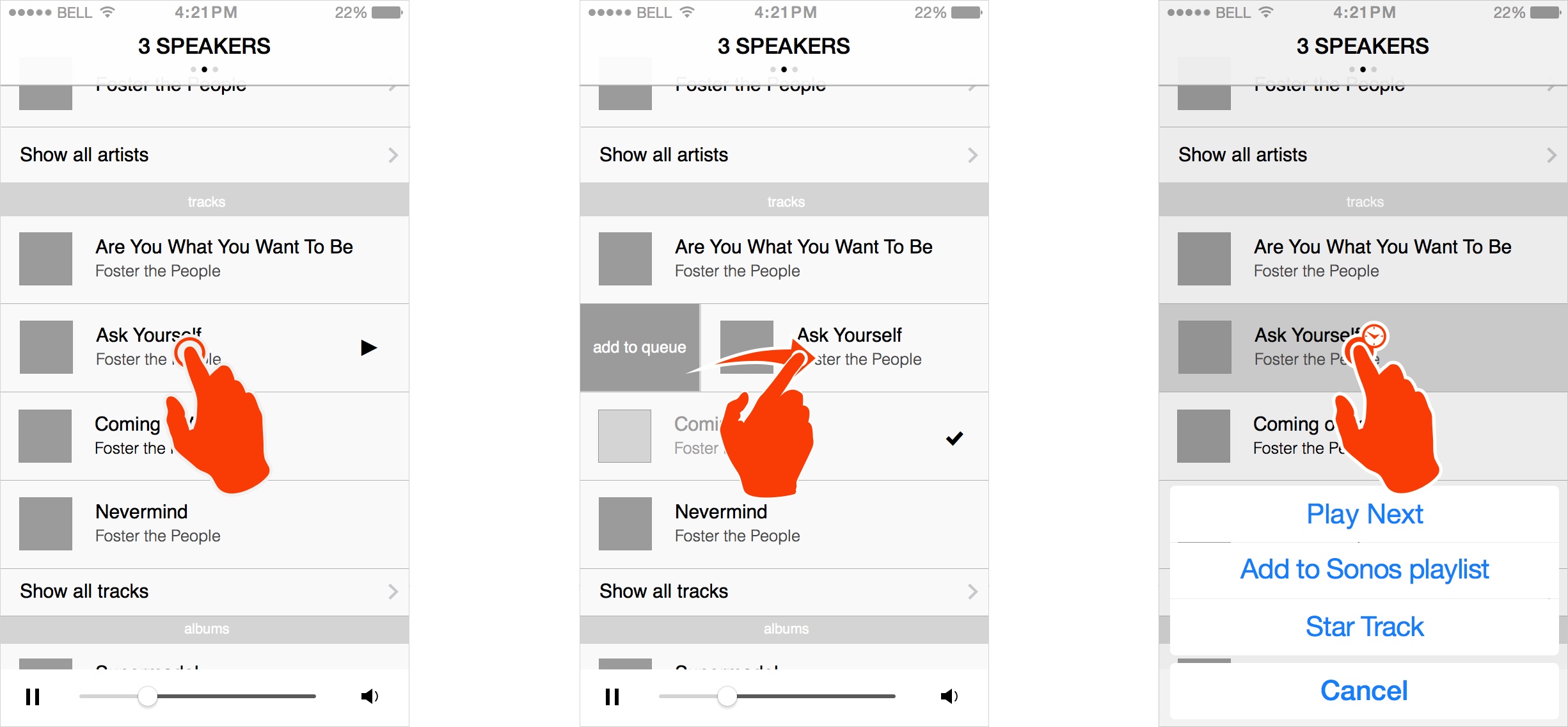 ⧉ Tap to play, swipe right to add to queue and longpress for options.
4. Include local playback in the app
One of the zones should always be your phone; seamlessly switch the music from one zone onto your phone and you’re ready to go! And when arriving home, your music automatically moves back to a preset zone upon arriving within reach of your wifi network. The Sonos app really has the potential to be your one-stop music app.

⧉ Seamlessly move the music from a zone to your phone and take it outside.
5. Allow for 3rd party integration
Sonos is a strong hardware brand, and could really be enriched with select 3rd party integration. One example that comes to mind is a proper integration with Philips Hue; have your cover art define the mood in your room, or introduce algorithms based on the music played. Sonos itself plays with this concept in their television ads; it’s really not that far-fetched.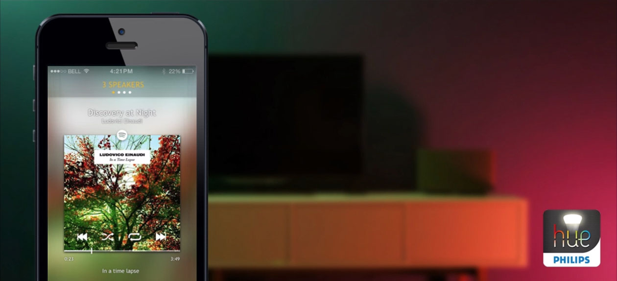 ⧉ Imagine when Sonos would integrate with Philips Hue!
► Press image to play animation
But 3rd party tie-ins could also extend to other types of hardware; like physical remotes for volume and play controls. Or having home automation systems that control lights, temperature and security also control the music on Sonos. Of course Sonos has long been ahead of the curve when it comes to wireless hardware in the home, but now that players like SmartThings, Revolv and Nest have started to gain serious ground in the home automation field, Sonos could gain a lot of momentum by offering an API to allow for cross-system integration.
A solid API would also allow for integration with 3rd party software. Just look at the hundreds of IFTTT recipes that have been created for Philips Hue. With a similar integration for Sonos the possibilities would be endless!

What do you think?
What is your experience with the current Sonos app? What is still missing in your opinion? We’d love to hear your thoughts in the comments below!



Geplaatst om: 15:54 op 22 August 2014 :
22 August 2014 op 15:54:
Waar kan ik deze downloaden 🙂 Vooral optie 4 zou mijn wens zijn
Geplaatst om: 18:57 op 26 August 2014 :
26 August 2014 op 18:57:
Really nice presentation!
Geplaatst om: 22:20 op 18 January 2015 :
18 January 2015 op 22:20:
You have my vote!
Geplaatst om: 08:50 op 23 June 2016 :
23 June 2016 op 08:50:
Just found this, but really like your way of looking at this. Was stunned by option 4. sounds completely basic. when will it be in our app?!?!! the first two points are also brilliantly executed. Hopefully you made Sonos aware of your site….