As designers we are asked all sorts of questions by our clients. The topics no longer only cover the subject of design. Today we will talk about A/B testing of your website. (Last time we discussed how to rank higher in Google with these 10 SEO steps.)
So, let’s get started!
Start with defining your goals.
A/B testing is one of the research methods for Website Optimization. You optimize your website to improve achieving your goals. Some goals are superficial, i.e. the number of visits to your website (beware of such vanity metrics). Better goals are, for example, to measure your website’s success by the number of conversions: leads, sold products or the number of social shares. Defining the right goals for your website is very important and will be the topic for a separate post soon.
What is A/B testing?
A/B Testing is, simply put, a research method to compare version A of a product (website) to a version B. I will talk here about a quantitative, partially automated A/B Testing method. In this method real visitors of your website are shown version A or version B of your website. An A/B testing tool will handle routing of the visitors to version A or B and calculating conversions and their differences.
In a pure A/B test you change only one variable per test, for example only the color of a button, not also it’s label.
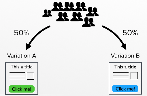
After some time you will be able, with the help of the tool, to statistically declare one of the versions as the winner. It is also possible to perform the experiment with even more variations, making it effectively an A/B/C/D and so on, test.
Comparing apples and oranges (aka. multivariate testing)
If you want to compare variations with multiple changes, like a button with different color and a page-title, you use a so called “multivariate” test. So instead of just the button color you can also test a different headline. This creates 2 x 2 = 4 different combinations that will be subject to testing.
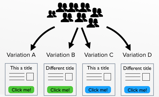
Remember, the more elements you change the more combinations you get. This means the test will have to run longer to reach statistical significance. If you are new to A/B testing you may want to avoid multivariate testing and start with basic A/B testing first.
When can you declare a winner (aka. Statistical Significance)
A winner can be proclaimed when “statistical significance” is reached. For a more scientific explanation read here and here. For a simplified way to look at it, read on:
Imagine that there is a Large Group of potential website visitors out there.
Some people within this Large Group will click on a blue button. Others will click on a green button. We want to pick the color that most people click, right? But you cannot test everybody in the Large Group because of restrictions.
You can invite some people (The Sample) from this Large Group and let them use your website with a green button. Let’s say that 60% of The Sample click the green button. Now we invite some more people (A similar Sample) from the Large Group and lets them use a website with a blue button. Let’s say that 50% of these people click the blue button.
Statistical significance will tell you how likely it is that the Large Group will behave the same as The Samples just did.
Who is using A/B testing?
Some of the biggest companies have created a culture of ongoing testing and improvements. They have literally performed hundreds or even thousands of these kind of A/B experiments to improve their website.

Read about Airbnb using A/B testing to improve their website
The Obama campaign an additional $60 million because of A/B testing
Google A/B tested for 41 different shades of blue
Can I use A/B testing?
Yes, you can!
1. You need some visitors and some time.
You do need patience to get enough traffic to variations for the test to reach statistical significance. How much traffic, depends on a number of things. Normally statistical significance of a test requires at least a couple of thousand visitors, but again it all really depends. A/B testing tools offer great help and in addition there are tools, like here, to help you calculate sample size.
2. You need a A/B testing tool.
3. You need designs for your variations.
Tools for A/B testing
There are a lot of tools out there. You can go for some free options such as Google content experiments or if you are working with WordPress you can find a number of plugins for A/B testing right here.
However there are some really nice paid A/B testing tools that allow you to do A/B testing without any technical skills. You can simply drag elements from your website in your browser and create a new variation on the fly. Optimizely, Visual Website Optimizer and Convert all offer A/B testing in the browser.

So now that we are all set, let’s throw in some examples to get you started.
Warning: do not draw any conclusions for your own website based on these experiments. Even the most experienced A/B test consultants encounter surprising results from A/B tests on many occasions. What works for one website doesn’t necessarily work for yours.
5 examples of A/B tests
Example 1: testing buttons
Some marketers will tell you that you should spend 50% of your time on the headline and the other 50% on your call to action (CTA). Smarter marketers will include the value of your content into this equation, but you get the point. CTA’s are great to start your A/B testing. Not only by adjusting shape, color, size and position, but the text as well.
In the example below changing the shape and color of the button resulted in a 35% increase in conversion.
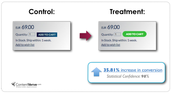
Check out these other examples at ContentVerve.com of A/B testing buttons.
Example 2: testing headlines
Your headline should be the hook to keep visitors from an immediate bounce. Copywriters at Upworthy apparently won’t choose which headlines to test until they have come up with at least 25 concept headlines. Most businesses will rely less on extremely captivating headlines, but nonetheless it will always be the first or second element of your website that visitors will notice.
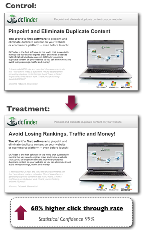
In the example below, borrowed from Unbounce, the second headline resulted in a 68% increase in click through rate.
Check out more examples of testing headlines at Unbounce.
Example 3: testing images
We previously told you that images are not your search engine’s biggest friend (number 8 on our 10 steps to rank higher on Google list). However, people are very different from search engines! Images (of people or arrows pointing around) not only draw attention towards a section of your website, but can have a big influence on reaching your goals.
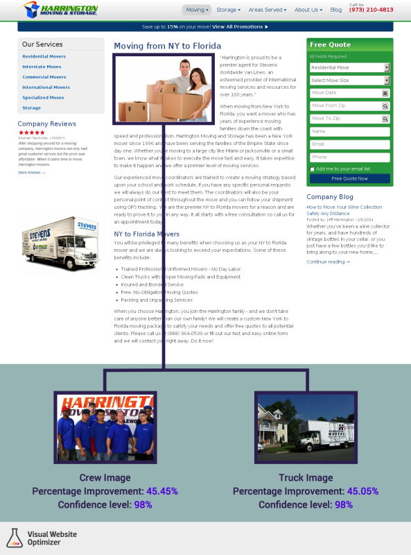
In this particular A/B/C test, they tested two non-stock photo variations of their page against the original (with stock photo). Both non-stock photo variations performed better than the original. (Reminder, this does not mean that stock photography won’t ever win. Test it yourself on your own website with your specific group of visitors).
For more information on this case, please visit the article on Visual Website Optimizer.
Example 4: testing additional elements, like social buttons
Sometimes we keep adding more and more to our websites and soon we have forgotten about the goals of the visitors and our goals for the website. Do we want visitors to like us on the Facebook or to buy our product directly?
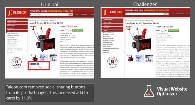
In this example removing the social buttons resulted in an increased conversion to the basket of 11.9%. Why? Automated A/B testing will not give the answer, but probably because of the fact that less buttons means less distraction and a like-box with “0” likes probably has a negative effect.
For more on this test-case, please check out the full story of this A/B test on the website of Visual Website Optimizer.
Example 5: testing forms
Don’t you just hate filling out those forms? Having to add your zip-code, birthday, phone-number (mobile and landline)….can be daunting. Visitors love short forms that stick to the essential information and nothing more. Surprisingly, whenever we are on the website’s owner side of the table we are tempted to asks as much information from our potential clients as possible.
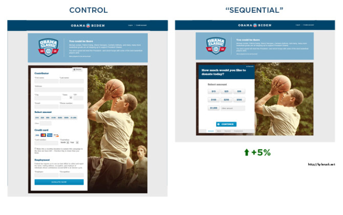
In the following example from the Obama campaign page, the team did not reduce the number of fields in the form, but successfully split them up in smaller tabbed chunks reducing form-anxiety for the visitors.
Read more about A/B testing during the Obama campaign.
We can help!
Feel free to leave any questions in the comments or send us an email about using A/B testing as well as other website research and optimisation techniques.


