


Effectory is a client we often work with. It didn’t take long for us to say yes to their proposal for a new project; redesigning their online questionnaires.
The design had a business like look & feel and consisted of multiple pages, filled with long lanes of the same question types. You’ve probably filled out a questionnaire in the past, and you know it’s not always as fun to answer a lot of questions. Effectory wanted to find a way to match the presentation of the questionnaire with its user, and make it more fun to answer all questions. This also meant the identity of the client could be more profound. During a kick-off with Effectory, we formed the foundation for the new questionnaire.
A single list vs. separate screens
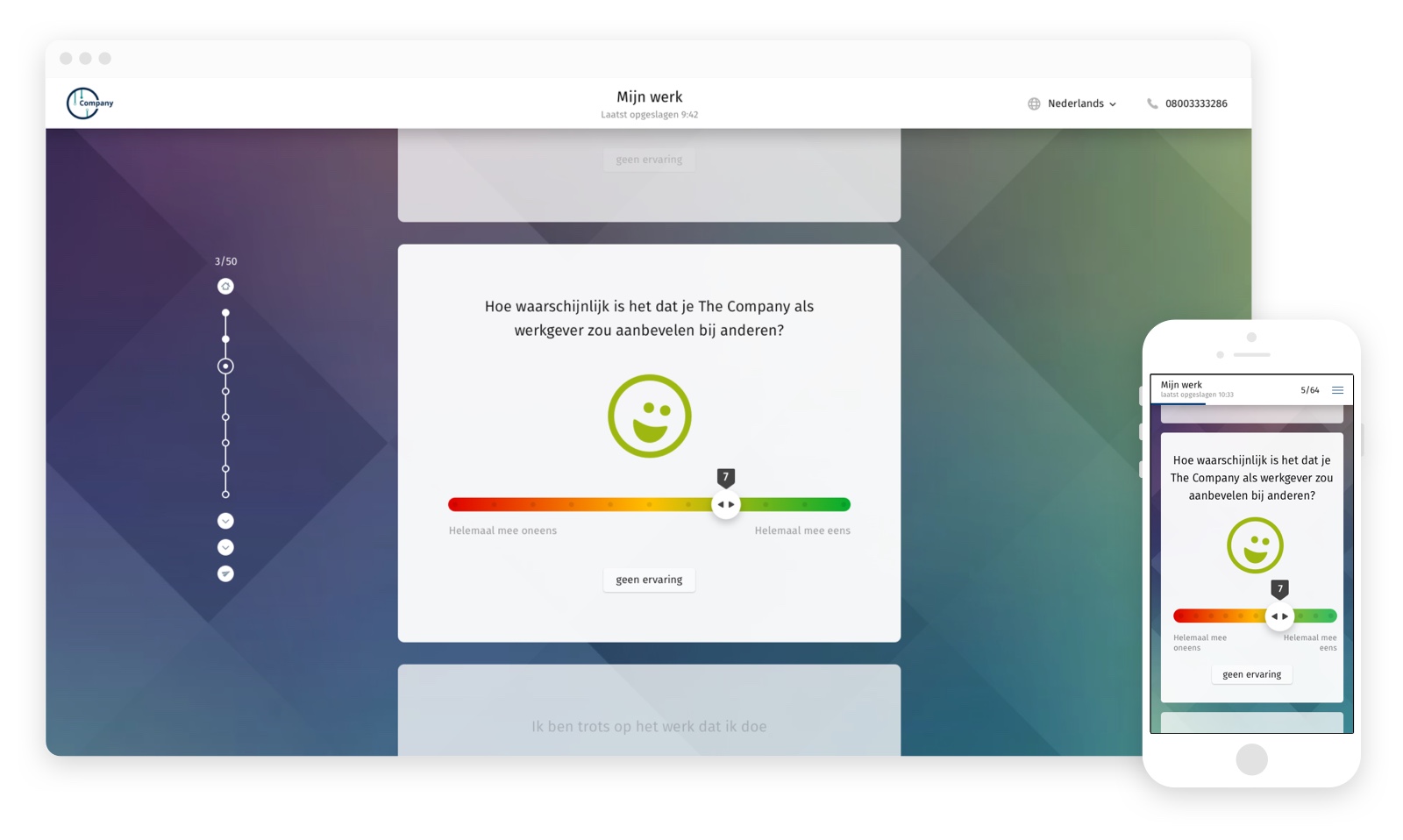
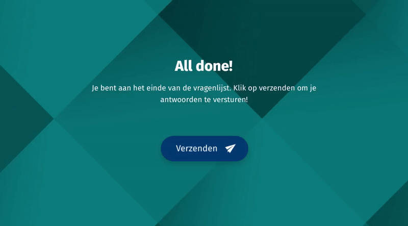
The previous design of the questionnaire had too many separate screens, where users easily got lost. That’s why we have chosen to keep the user on the same screen as much as possible, so he doesn’t have to navigate through different screens with questions. We have created a clear start and end of the questionnaire. To prevent the user might get lost we added more space between all questions, of which one is always in focus (at the center of the screen). It is also possible to scroll through the list, the progress bar will always show you how many of the total questions have already been answered.
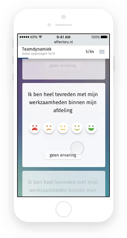
An important focus was to make the questionnaire work well on mobile. The way it works is the same as desktop, there is always one question in focus and you can still scroll down the entire list of questions. By pulling the questions apart from one another, the questionnaire is easier to use on mobile. We are excited to find out how the mobile use will increase!
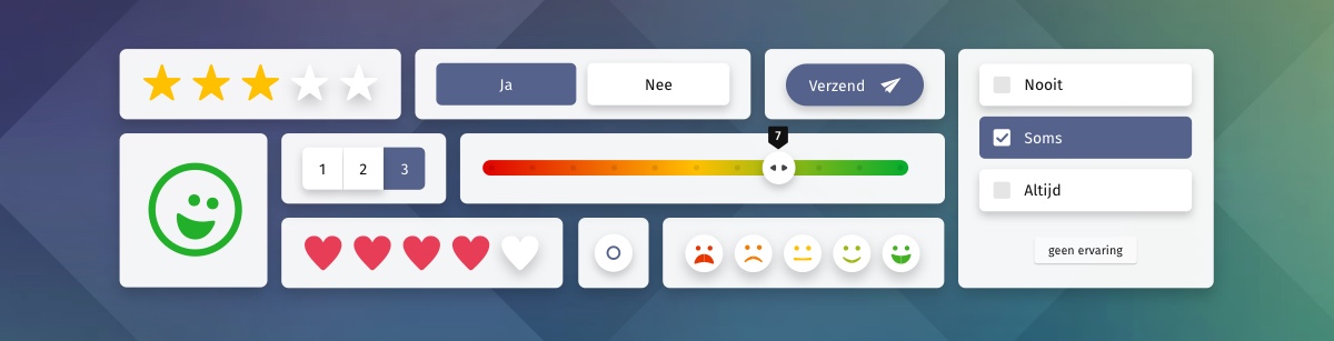
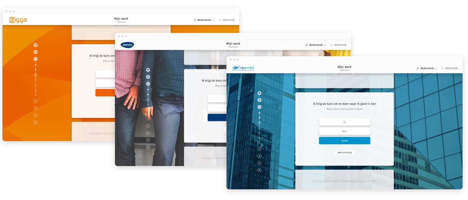
During the design of the visual style, we kept in mind the different brands Effectory work for. Therefore we chose to make some elements editable, so the questionnaires can match the clients look and feel. Effectory can now offer question types in different styles, to fit their client’s image.
You can think of a nicer thing to do than answering a list of 80 questions. That was one of our biggest challenges: how could we keep users motivated and interested during the task of filling in the questionnaire. Micro animations were part of the solutions. We added clear and well-timed transitions to applications, which shows the user when a question is answered and how many questions he still has to answer.
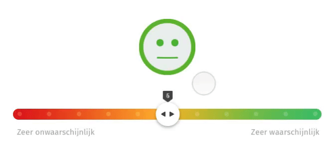
After answering a question the user is rewarded with a short animation. This gives some satisfaction to the user, but just as important, it gives feedback that a question has been answered before it moves out of focus.
Are you curious to see a demo of these new questionnaires? Take a look at effectory.com for more information.