Pull to refresh
It works like this:
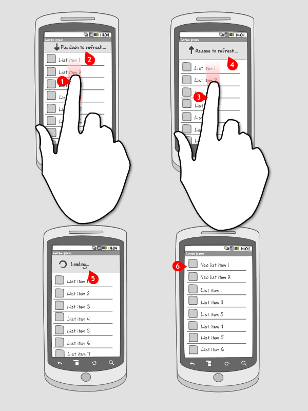
-
The user pulls down a list.
-
A message appears, telling the user he can pull down the list to refresh.
-
The user pulls the list further down.
-
A new message appears, telling the user that the list will refresh when he releases it.
-
The user lets go.
-
A refreshing or loading message appears.
-
The refreshing message disappears and a new list is shown, with the new items at the top of the list.
Use when
The pull to refresh pattern can be applied when you need to show a list of items that is dynamic, e.g. containing news items, and you don’t automatically refresh this content. By 'pulling to refresh' the list of items is refreshed, and the new items are shown at the top.
An other way to let users refresh content is by applying an refresh button, but you need to have the space to put one.
The Good
- It saves space as you don’t need to place a refresh button.
- Easy to discover as long as the newest item is at the top of the list. It is a natural consequence of scrolling to the top.
- Need not to download all the data at once,can be downloaded in parts (Prafulla)
The Bad
- No visual clue to discover this functionality other than ‘scrolling further up’.
- It may be better in some cases to simply keep the list up-to-date automatically so that no interaction is needed at all.
- Click on an element of the list may some times not work because the move is interpreted as a pull down and not a click. (alexandre durandet)
- Twitter currently has a patent application for it although their current policy is not to enforce. http://www.google.com/patents?id=C3PTAAAA (Royce Shin)
Examples



Tweakers.net




Pulse







3 Responses to Pull to refresh
C’mon, it has to do it automatically with no hints or interaction whatsoever.
If too many items keep coming, pause button will do.
IMHO
Great, thanks for your share!
@2012-04-15 18:29
Might just be me, but on Android pull to refresh doesn’t really make sense to me.
This is because the default way of scrolling is showing an ‘overscroll glow’ on a side whereas on iOS you can tease your users if the scroll up, because of the bounciness.