Date and Time picker – Wheel
It works like this:

-
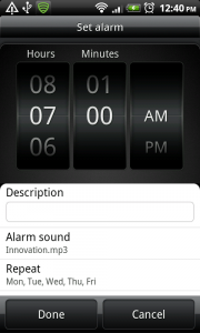
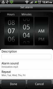
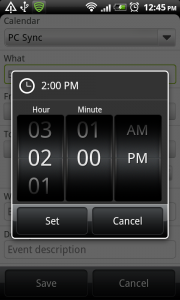
After tapping a specified target (usually a touch target showing the time) a time picker dialog or window opens over the current screen. The time picker contains at least two wheels, and two buttons for confirming and canceling the action. Additionally, extra wheels can be added for entering a year, or am/pm choice. The selected numbers in the wheel get a highlight.
-
The user can set the time by sliding over the wheels, making them spin slowly. Flinging the wheels makes them spin faster. The wheels will stop slowly after the fling.
-
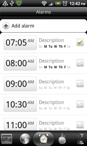
By tapping the ‘ok’ button, the entered time is set. Tapping the ‘cancel’ button discards the time. The time picker window closes to return to the previous screen.
Note: this pattern is specific to HTC Sense. It is not a standard android component.
Use when
The wheel date and time picker is useful in every situation when the user has to set the time or date. it provides a more fun way of setting date and time than the standard plus-minus way. If you want your users to be able to set the time using the keyboard, consider using the plus minus date and time picker.
The Good
- More 'fun' than the traditional plus minus date and time picker
- Easily understandable for users, provides familiar interaction
- hi, new to the site, thanks. (Opismiphece)
- Provides an awesome UX for touch devices! Way better than +/- (Levi)
The Bad
- The user can't use the keyboard to set the wheels.
- The wheel for minutes stops at '59' and doesn't continue to '00', so a lot of sliding is necessary to get from '59' to '00'
- Takes more time to enter a time than a keyboard input would (Brandon)
- Users can't pick a date from a calendar, so it becomes hard to pick dates like the second friday of the month (Jesse)
- Fiddly and sensitive; very easy to scroll too far, and have to go back and forwards several times to select desired date/time (Steve)
- This seems to be a HTC specific widget. I couldn\'t find it in the Android APIs. (Janusz)
- If I would see this in an App I would think somebody tried to emulate an iPhone at all costs and would uninstall the app (Janusz)
Examples
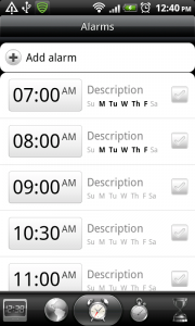
HTC Sense Alarm
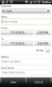
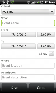
HTC Sense Calendar

12 Responses to Date and Time picker – Wheel
I did a quick search and it looks like a developer whipped up a custom widget to use in any version of Android.
http://code.google.com/p/android-wheel/
It looks great, but I really hate having to use this input method for date and time selection. I’d rather have a keypad for a quick time selection and a small calendar for a date (range).
I agree with Frank. I actually despise these little wheels. They are a great example of something that looks clever and cool but actually sucks to use.
I have to disagree – I love ’em.
You can find the javascript implementation of it here http://code.google.com/p/mobiscroll/
And it’s pretty customizable too!
Have been using iPhone for more than a year and picking time and dates with a wheel and never wanted anything “advanced”. If the action was repetitive, then a keypad would make sense but otherwise the usability of the wheel is superior in my eyes.
In fact I’m looking for a calendar/alarm that uses this method for my android phone
I use alarms a lot, and spinning those irritating wheels takes forever compared to just keying the number from a numpad. Wheels look cool but they waste my time. Aren’t smartphones supposed to be productivity tools?
Can anyone give me code how to make this..I need this in my project..thnx in advance..
Agreed Stephen. Loading the keyboard takes time, the keys are small, and it kills me having to use the backspace button or double tapping to mark the present numbers in order to enter a new hours, then new minutes.
How do I install this stuff to my Samsung SIII?
Do you have some idea to create a unique picker for date and time like iOS?
I’m working on a meditation timer and am trying to decide on how to do the actual setting of the duration. I want to maintain compatibility back to 2.1, so right now it’s just an EditText which the user types the duration into in standard format (1:23). But this isn’t very fun and isn’t the kind of UX that is expected with modern devices. What should I do?