Static list
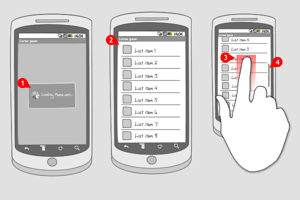
It works like this:

-
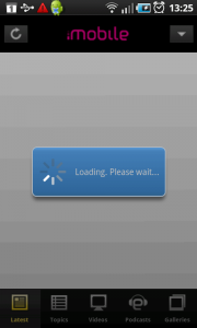
When loading a static list, it is possible to display a progress dialog to let users know content is loading. This is usually done when it takes more than x seconds to load the content.
-
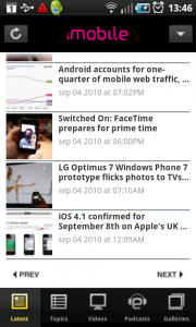
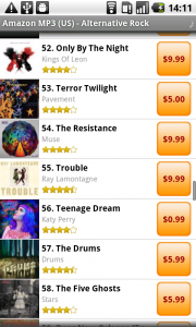
Content is displayed in a list. Items contain a title and are usually accompanied by an icon or image. Additional information is possible, as long as it’s still noticeable that it’s a list.
-
When the user moves with the finger in the direction he wants to scroll (in this case up), the list moves up through the screen, and new items are visible.
-
When the screen is still moving, an indicator shows the position of the viewed items in the complete list. When the user stops scrolling and the list stops moving, the indicator slowly fades out.
Use when
A list can be useful lots of times and can therefore be applied very often. A list view is a simple and straightforward way to display navigation items, especially when the number of items is not too extensive and you want your content to be viewed in one screen. The list items are put in a single level, vertically scrollable list. Sub-headers that divide the items into groups can be used to make navigation easier.
When you have a considerable amount of navigation items, think about using an expandable list, a drill down, or let the list items be loaded dynamically. A good solution can in this case also be using a scroll thumb, but then items have to be sorted alphabetically.
The Good
- All content is on screen at the same time - no waiting or tapping for more content
The Bad
- Can take more time to load
- Requires more scrolling than paged content
Examples
Engadget


Amazon MP3

One Response to Static list
Thank you for your article, I learned a lot from this.