Dashboard – Features
It works like this:

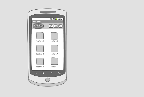
A dashboard is the welcoming screen of your app, it provides a starting point for the user. A features dashboard shows what the user can do with the app and highlights what’s new. The dashboard can be static or dynamic, e.g. you can incorporate live wallpapers and changing content such as news items.
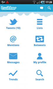
A features dashboard lays out the key functionality of your app full screen. It provides easy access to important tasks and functions. Features are displayed as an icon plus title in a grid lay-out.
Use when
A features dashboard can be used when your application is task-oriented and supports multiple tasks or features. A dashboard is ideal if you want to provide a quick overview of interesting, new, or frequently used tasks. A dashboard can be paired with an action bar, e.g. to provide a search option for users.
The Good
- A user has easy access to the most important tasks
- The dashboard gives an overview of the application's functionality
- If customizable can be a set of key features the user what quick access to. (Bernardo)
- Good for intermediate to expert users, because they roughly know what to do when they launch the app. (Borrys Hasian)
The Bad
- A dashboard takes up a lot of screen real estate
- The features displayed in the dashboard can be perceived as the only features of the app
- A dashboard can present an extra click to get to the actual data (pjv)
- Not easy to develop categories with gridView... (yurena)
- Slow navigation switching tasks. Have to go to dashboard and then choose the desired task/view.An app should start in the most frequent view (Martin)
Examples

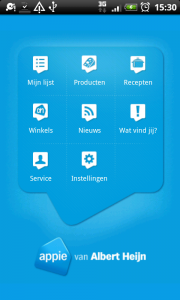
Appie

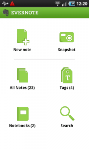
Evernote

2 Responses to Dashboard – Features
Thanks for the precise tutorial..
the blog is very very nice and all of the posts but you should upload samples of the designs implemented on android not only ideas and graphs