Dashboard – Categories
It works like this:
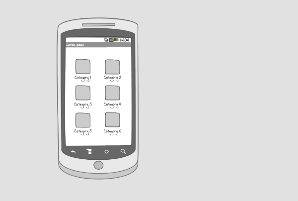
A dashboard is the welcoming screen of your app. It provides a starting point for the user. A dashboard can be static or dynamic, e.g. you can incorporate live wallpapers or changing content such as news items.
On a category dashboard, entrance points to content are displayed in several categories. The categories are represented by an icon and a title, and lie full screen in a grid orientation. This lay-out allows the user to find content faster.
Use when
A category dashboard can be used when your app is content-focused and your content can be divided into categories. To improve searchability, a search bar can be incorporated into the dashboard. The dashboard can also be used together with an action bar.
The Good
- Good overview of the application's content
- Easy starting point for navigating through vasts amount of content
- Much better if a user can customize the order of the items on the dashboard. It helps user to quickly access the most frequently used item. (Borrys Hasian)
The Bad
- A dashboard takes up a lot of screen estate
- Can mean an extra step in navigating to desired content
- For some apps, it is more useful to land directly into the application, instead of going through a dashboard
- defining a set of categories may appear to a user that the application is limited to these specified categories. This may not be the case. (RoyL)
- Might be confusing for beginners, as they tend to ask \'Where to start?\' (Borrys Hasian)
Examples
Documents to Go
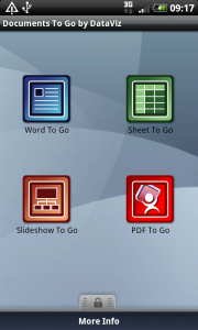
1 Documents to go displays the 4 types of documents the app can handle. Tapping on the 'pdf to go' icon...
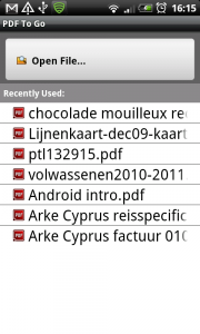
2 ... shows a list of pdf-documents that are available on the phone.
Google Places
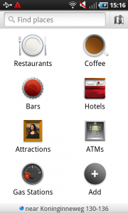
1 Google Places shows different categories of places to find in the neighborhood. Custom categories can be added by the user. The dashboard includes a searchbar to facilitate finding places.
Factbook
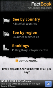
1 The reference app Factbook offers access to data and statistics of countries. On its dashboard you can search for data per category, that are displayed in a list of 3. The screen space that is left is used to show facts and a Google-add.