Thumbs up/down
It works like this:
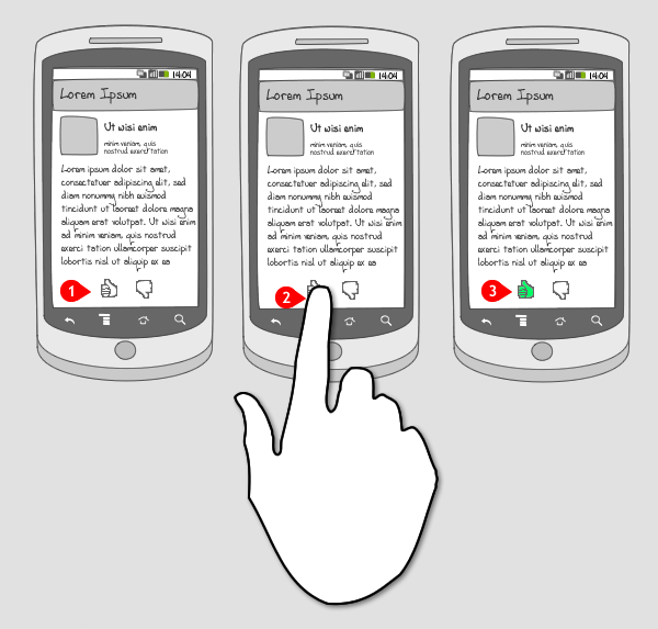
-
User views a particular piece of content with a thumbs up and thumbs down button.
-
User hits the thumbs up/down button.
-
The selected thumb is highlighted in order to show what has been selected.
Use when
Thumbs up/down is a classical way of rating content. You either like it or you don’t. A binary choice. Use ratings if you think a more precise type of judgement is needed. You’ll probably need to have users log in first, otherwise it is hard to store the rating or prevent misuse.
The Good
- Easy to understand metaphor that most users will understand without any explanation.
The Bad
- You get both negative and positive ratings. Consider a ‘like button’ if you don’t want to emphasize negative ratings.
Examples
YouTube
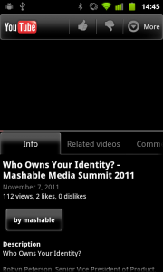
1 In YouTube you can rate videos using the thumbs up/down buttons at the top of the screen. You have to be logged-in to use the buttons.
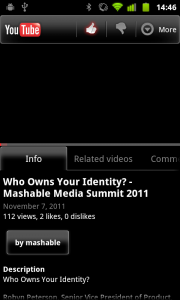
2 When you press the thumbs up button it is highlighted. Your choice is remembered but you can always change it again.
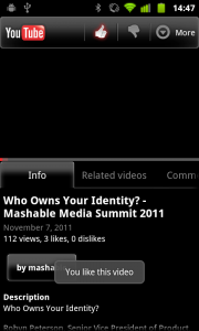
3 Right after you you have pressed the thumbs up button a toast message appears, confirming that the vido was liked.
Google places
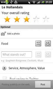
1 In Google places you can add categories for which you want to give positive or negative feedback. Here the thumbs up and down are replaced by a happy face and a not happy face. This works equally well as the thumbs up or down, because it represents the same.
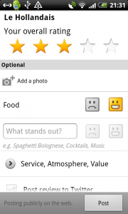
2 When the user touches the happy button, it is highlighted.
StumbleUpon
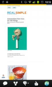
1 In StumbleUpon, the user can give feedback to the webpage that is shown by touching the thumbs up or down button in the bottom toolbar.
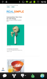
2 When the thumbs up button is touched, it is highlighted in green.
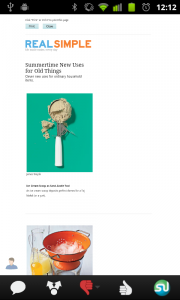
3 The user can change his choice and directly tap the thumbs down button. It is highlighted in red.