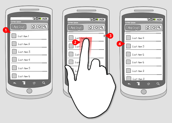
Slide to scroll
It works like this:

-
Content is viewed in a list.
-
To view more content, the user puts his finger on the screen, and swipes it up. The screen moves up with the finger in the same direction. The user can also swipe in the opposite direction.
-
An indicator shows how much content is still available.
-
When the user lets the screen go, it stays in the same position.
Use when
When content doesn't fit the screen, the user should be able to scroll up. To keep control over the movement of the screen the user can use the 'slide' gesture. This way he can control the speed and how far the screen slides up. The slide to scroll gesture is often used for reading. It is a standard gesture, so it should always be available.
When the user wants to scroll up faster, he can use the fling to scroll gesture (this option should also always be available), or use the scroll thumb.
The Good
- The user is in control over how fast he scrolls through the content
The Bad
- Every sliding movement, the user can only move as far as the finger goes over the screen
Examples

2 Responses to Slide to scroll
please give me it’s source.
any sources?