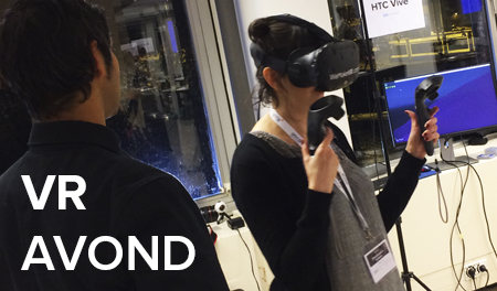
How do people with bad sight experience their surrounding? And how do they use digital products? We invited Visio to our monthly team get together to tell us more. We took many learnings when finding out how to keep in mind the visually impaired in our design process. Here are our most important ones.
About Visio
Visio is the go-to center for the visually impaired and the blind. They offer information and advice on this matter, but also do research, coaching, rehabilitation, and education. Within Visio, there are several ongoing research projects with scientists and other companies in the branch. We invited Timon van Hasselt (Advisor Supporting Technology) and Jos de Jong (software developer) to our office in Rotterdam to present a lecture and workshop.
UNITiD.nl’s accessibility
We quickly found out that there’s room for improvement in the accessibility of our own website. It’s difficult, for instance, For visually impaired people. for instance, it’s difficult to see in what part of the website they are because of the way we use colours. We learned that one of the difficulties for blind or visually impaired people is that they lose the overview: they don’t know where they are within an app or website.

A different perspective of digital products
To experience what a visually impaired person actually sees, we got to use special glasses. We learned that we saw hazy or spotted images or our sight was just very limited. We could hardly believe that someone who sees that badly can use an app!
When smartphones with touch screens -and no buttons- became the standard, we thought using a mobile phone would become impossible for the blind and visually impaired. However, Timon explained to us that these changes made phones more accessible for people who can not see well. This is mainly thanks to good voice over functionalities, especially iOS. Thanks to voice over, these users can exactly hear what’s on the screen and navigate more easily.
After hearing this, we tried to use our iPhone and an app with the special glasses on and the voice over as our guide. It took some patience and careful listening, but with a blurry sight we managed to do it. Try it yourself!
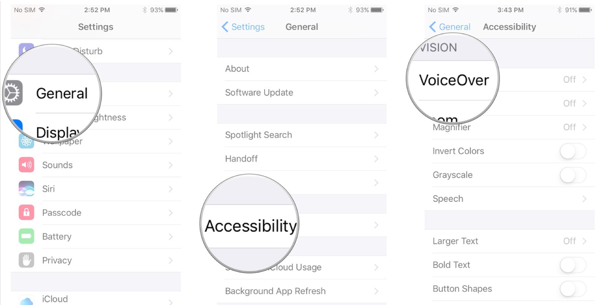
*Turn on VoiceOver easily in your settings or ask Siri to turn on VoiceOver.
Before the workshop started, the people of Visio gave us some tips for designing digital products that are useable for visually impaired people:
Use:
- A good colour contrast and a readable font size
- HTML to publish all information
- A combination of colour, form and text to point out an action
- A lineair, logical design
- Clear groups of elements that belong together
Avoid:
- A low colour contrast
- Hiding information in downloads
- Single colour use to make a point
- Spreading content over a whole page
- Space between actions and context
Get to work!
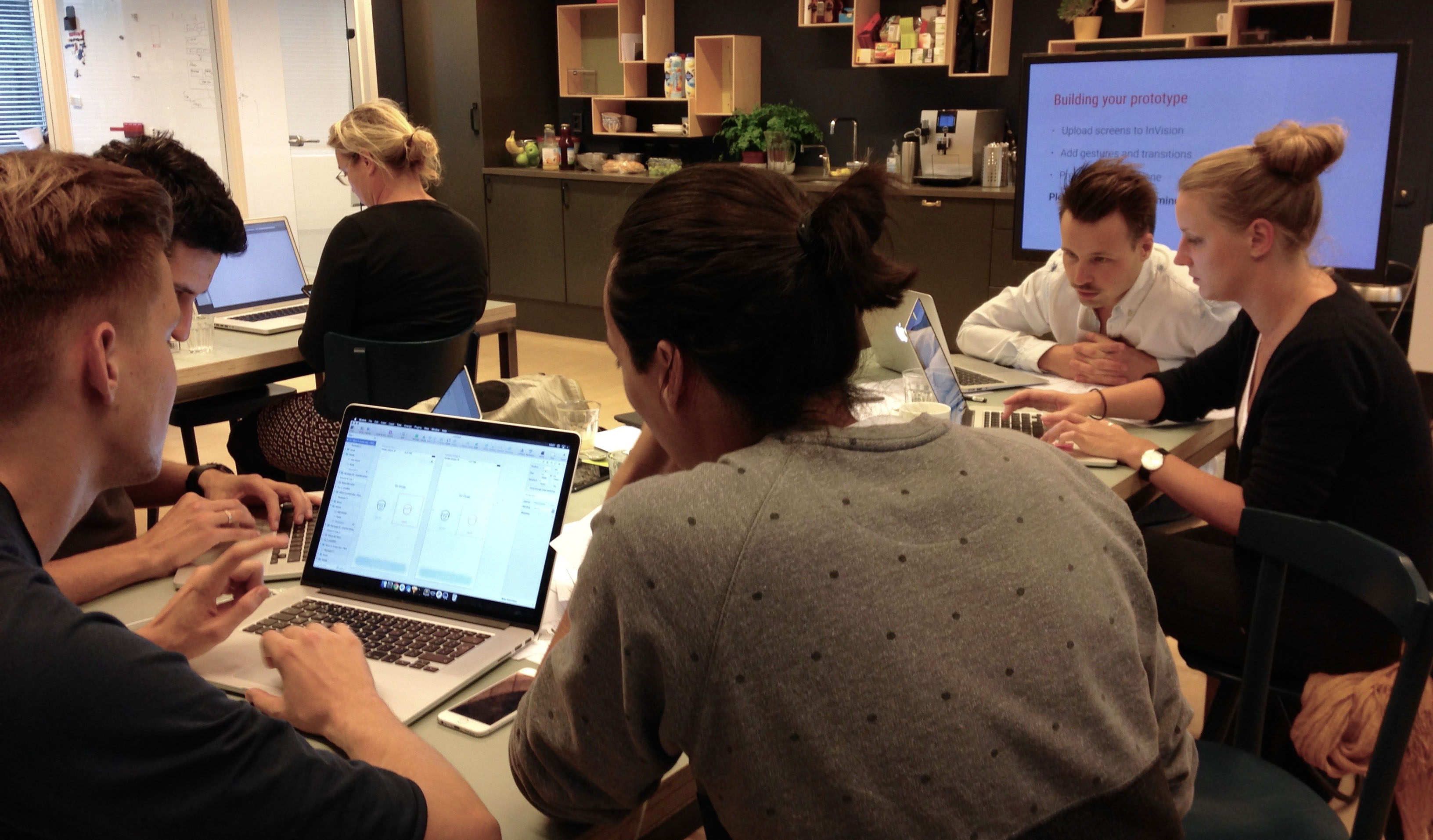
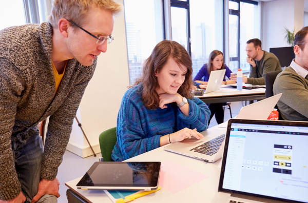
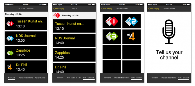
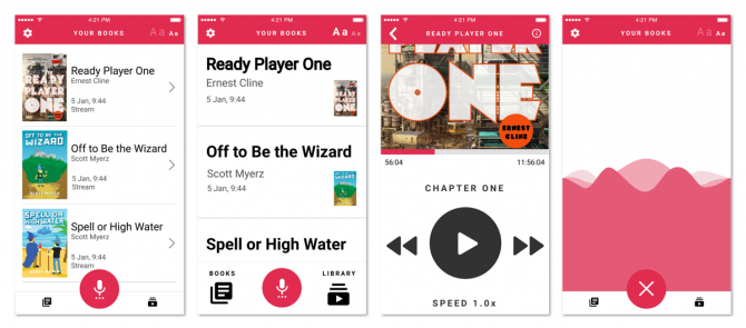
To put our newly acquired knowledge to the test we were assigned with a special task: redesign a listening book app or an existing tv guide app for visually impaired people. We formed separate groups and worked out some concepts with help of Figma. Some teams started from scratch with a whole new design, while others tried to make the existing design more accessible. It was very interesting to see the different starting point and outcome of each group. Below you find our most important learnings.
Start with toptasks
- Focus on overview, even if you can not see the interface
- The order of functionalities is more important than their position
- Limit the number of functionalities and cluster if possible
- Emphasize functionality, not graphic design
- An accessible app does not have to be an ugly app
- Test the design with the VoiceOver functionality on your phone
Test accessibility in real life
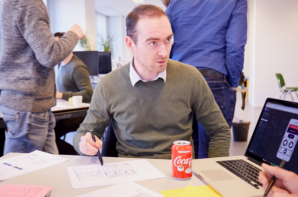
Our meeting with Visio was an eye opener to many colleagues. Besides people who are continuously visually impaired, there are also people who do not see well in certain situations. Like people who want to see something without their glasses or people who are blinded by the sun that shines on their screen. Visio made us aware that some of our own users are people with reduced visibility. From now on, we will look differently at designing for a project. It’s like we see things through the eyes of a visually impaired person now. How logical are the buttons, typography, colours and functionalities? And is it still possible to navigate through the app when the voice over option is turned off?
Our intention for this year is to dive a bit deeper into accessibility. We’d like to take the visually impaired into consideration in all the designs we create. To be continued!


