Share button
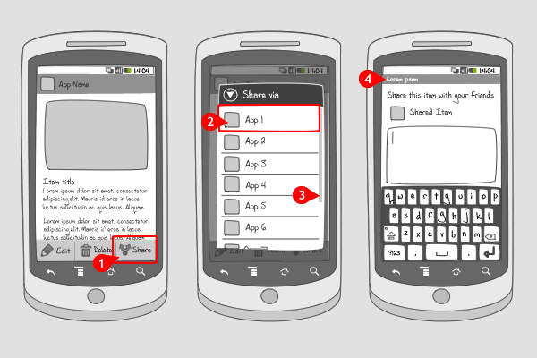
It works like this:
-
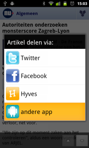
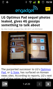
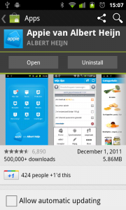
A user views any type of content and selects the ‘share’ button.
-
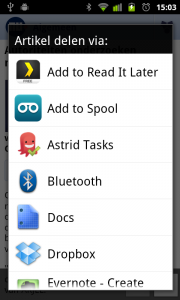
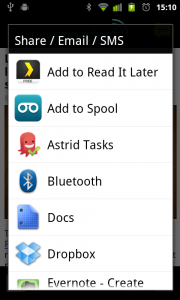
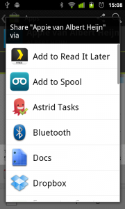
A dialog shows a list of apps that are available for sharing the content.
-
If there are more apps than can be displayed in the dialog, the list will become scrollable .
-
After selecting an app, the user is guided through the steps needed to complete the sharing process. These steps differ per app.After completing the sharing process, the user returns to the original view in the first image
Use when
The user wants to share an object or send it to some application/location. The typical use is with picture applications where users can use the share button to post it on Facebook or upload it to an online picture gallery. On Android the sharing mechanism is extendable and any application can add itself to the list. As such the possibilities are numerous. If you want to exercise more control over the sharing functionality, try using a custom sharing option.
The Good
- A standard mechanism on Android phones that users will learn and recognize
- Direct and simple
- Future-proof as list is automatically updated for each new sharing target the user installs (Richard Le Mesurier)
The Bad
- The list of sharing services is not very intelligent. The apps appear in alphabetic order and not in order of most relevance/usage.
- If the list gets long the user needs to scroll to the relevant service
- Will not show sharing option with no app installed
- No control over the order and appearance of apps in the list
Examples
Nu.nl

Engadget
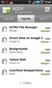
Market
3 Responses to Share button
It’s also a very undervalued way to workaround the lack of a particular permission WITH the user consent.
(example: an application with no Internet / SD card permission could let the user share the database/exported data using the share permission.
The user will thus be able to export his data to the SD card (sharing with a filemanager), to his mailbox (sharing with GMail), to his DropBox and to pretty much every file-enabled application.
I am trying to create some Android mockups and was wondering what type of a control the sharing button is. It looks like a options menu, but I cannot find it in my library. I am using Justinmind prototyper.
Engadget – Using the iOS share icon is quite simply a bad idea!